Whenever we talk about the healthcare sector, the first thing that pops up is the massive amount of various data types they deal with. After all, 30% of healthcare data contributes to global data. And imagine they get into a data pool of patient records, lab tests, diagnostic images, and treatment plans!
Phew! That is too much to begin with.
However, effectively communicating the details to your team members is the secret to driving patient care.
How?
Think of a communication breakdown. There can be a medication error or a treatment delay. You are literally compromising patient safety.
Consequences?
You would land yourself into legal problems, break the bank, and most devastatingly, put your patient’s health at risk.
Here is where data visualization comes in.
Data visualization helps you to understand and process the data through visual elements like graphs, charts, and maps.
You may think, how is it possible to enhance team communication through this technique?
Let us take an example.
Suppose a physician prescribed a combination of medicines to a patient for diabetes. There are two more roles here- the pharmacist and the nurse. The pharmacist is responsible for giving the exact medicine or the correct drug combination prescribed, and the nurse for the apt dosage to the patient.
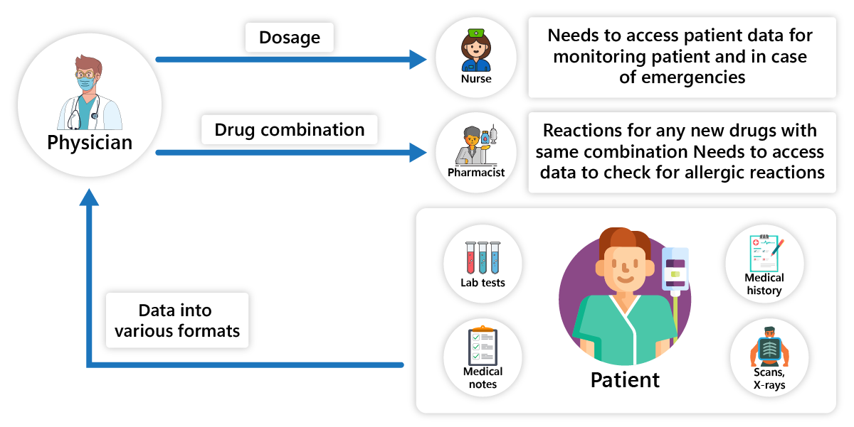
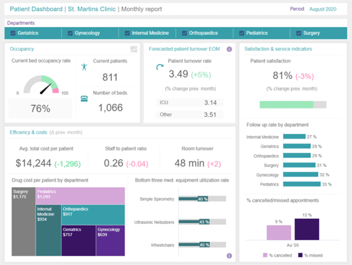
However, this information flows between different stakeholders through heaps of data like lab results, allergy details, medical history, and medical notes, making it complex to dig through. With data visualization, you can view this fragmented information in a unified manner. You will have a dashboard displaying your data as a single snapshot of the patient. So, stakeholders can make decisions wisely with such comprehensive information at their fingertips and have clear and transparent communication across the department.
To precisely state what data visualization brings to the table:
- Simplified complex information with easy-to-understand visual elements.
- Real-time patient data updates.
- Standardized information across all the departments.
- Facilitates a common visual language to communicate in multiple departments.
- Quickly identifies any data spike or anomalies, triggering immediate attention to the patient.
- Involving patients throughout their care journey with you with such visual representations.
So, if you are grappling with-
- Inaccurate or outdated information
- Data misinterpretation due to heaps of documents
- Cross-disciplinary communication
- Lack of prompt actions
- Non-compliance
- Patient disengagement, then data visualization is your one-stop solution.
Although you can achieve your goals with data visualization tools like Tableau, Power BI, Qlik Sense, ChartBlocks, Domo, or other popular tools the market has, partnering with a leading data visualization company will be a winning streak.
Data visualization comes with abundant BTS work. So, only the right expertise can save you from getting baffled.
One of our clients wanted to implement data visualization for their hospital. We used Tableau in the following manner:
We used Tableau Desktop to create visualizations. We helped them share and collaborate on visualizations with Tableau Server. We integrated SQL server and MySQL databases to store patient data.
What we did:
- Created interactive dashboards displaying health status, treatments, and patient outcomes.
- We integrated multiple data sources like lab results, medical notes, wearables, EHR systems, and others on a unified platform.
- We set role-based access to sensitive information.
- Apart from setting role-based access, we implemented data masking and anonymization for better data privacy.
- We helped implement the statistical analysis of these masked data for better decision-making in real time.
- Clinicians can identify trends, patterns, and anomalies for better treatment plans by visualizing this masked data.
- Also, the system generates reports for stakeholders.
Our client’s success was the effort of our seasoned experts.
Our team comprised of Data Analysts handling all the data cleansing part for accurate data visualization, BI developers for designing and developing interactive dashboards, Data Administrators to manage all the database operations, and IT support for tech support in software installation, configuration, and troubleshooting. Apart from this, we had some handholding from our clients. We required some domain experts to ensure the correct implementation of the solution and get the desired results.
Now you know how much effort is required to achieve your data visualization goal for enhanced team communication. Also, as stated earlier, there’s a lot of work behind implementing your data visualization tool. Getting accurate information on the dashboard is crucial for your decision-making. In fact, everything relies on how your data is cleansed and put into a format that makes sense and then creates dashboards to visualize this data. So, partnering with a data visualization company is a win-win deal for you. Although, the choice is yours.
Top FAQs for healthcare data visualization
What is healthcare data visualization?
There is a massive amount of healthcare data from various sources. This data is condensed into one single platform for better decision-making. So, integrating, cleansing, and making sense of this complex data, and later, visualizing it through graphs, charts, or maps is healthcare data visualization.
Can data visualization tools help in healthcare management?
Yes, data visualization tools like Power BI and Tableau offer healthcare organizations:
- Operational efficiencies
- Personalization
- Better patient outcomes
- Seamless team communication
- Reduced manual efforts and errors
What factors must be considered while implementing data visualization in healthcare?
You must consider the following:
- Patient data privacy and security
- Integration with your legacy systems
- Compliance and regulations
- Analysis of secured data
- User training to effectively use the data visualization tool.
What is the cost of implementing a data visualization tool?
Every business is unique, so the cost to implement it will be different. The cost depends on factors like:
- Licensing
- Implementation services
- Training
- Support
- Additional features
Still, to give a rough figure, it can range anywhere from a few thousand to hundreds of thousands of dollars for the complex requirements.