
The healthcare industry generates massive amounts of data every day. Healthcare generates 30% of the data volume globally. So, collecting this enormous data and making sense is a herculean task. Here is where data visualization comes in.
Data visualization helps to present your complex healthcare data in an understandable and interpretable visual format. With data visualization, you can:
- Simplify your complex datasets into a more comprehensible pattern.
- Identify trends, patterns, and outliers quickly.
- Diagnose precisely and craft personalized treatment plans.
- Facilitate communication with colleagues, patients, and stakeholders.
Despite such benefits, picking up the right data visualization tool is vital. To expedite the process of choosing the right one, we listed a few requisites:
- The tool must handle diverse data sources. For example, your data resides in sources like EHRs, smartwatches, health apps, spreadsheets, and databases. The visualization tool must integrate all these data sources seamlessly.
- Your tool must have interactive features. For example, your tool must allow you to drill down and filter data for easy analysis.
- Your tool must prioritize security and compliance. For example, some data can be sensitive and protected. The tool must have robust security features to visualize such protected data.
- The tool must be user-friendly and have a low learning curve.
- The tool must allow you to create custom visualizations and reports according to your needs.
There are some popular data visualization tools like Tableau and Power BI that cover all the prerequisites mentioned for your healthcare data.
However, just shortlisting your data visualization tool is not enough. There is abundant work to do after you pick the right tool. Usually, we have a strategic implementation process for creating visually appealing representations for our clients. Lately, we have published a blog on how we crafted a Power BI dashboard for our real estate client.
Let us brief you on our approach
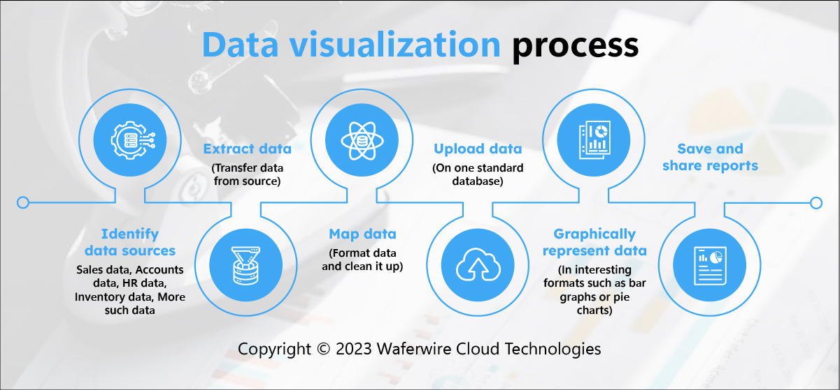
- We identify your goals for data visualization.
- We identify your target audience. For example, if you want to build a dashboard that gives resource allocation details to different departments, then your target set is hospital admin.
- Next, we collect and organize your data from different, reliable sources.
- Then, we perform data preprocessing on this raw data. The preprocessing includes cleansing, filtering, and transforming data.
- Once we clean the data, we choose the apt visualization for your data. For example, if you desire to check the patient flow throughout the day in the emergency department, we may probably select a heat map or time series line chart for your visualization.
- Next, we design your visualization- Give clear, concise titles, use appropriate labels and colors, and keep it clean and uncluttered.
- We create your visualization and customize it accordingly.
- We continuously test your visualization to ensure accuracy and correctness.
- Power BI embeds these visualizations into your reports, web applications, and presentations.
- As your data will continuously come in, your visualization requires regular updates. So, maintain this relevancy to changing needs and goals.
- Finally, you are ready to use these visualizations as a tool for storytelling, conveying insights, and making data-driven decisions.
- Be open to feedback and make improvements accordingly.
To summarize, data visualization is a win-win for the healthcare sector. Today, where there is a pool of data, clinicians, researchers, and pharma companies are struggling to manage this data and make sense of it to make better decisions. Therefore, imagine when you get the right tool to manage this data effectively and process it to get insights and identify trends and patterns from this data. That sounds like crafting a way toward healthcare advancements! So, why wait? Partner with a data analytics company and start harnessing the power of data visualization for revolutionary patient care and drug development.
If you wish to have a demo of how we can offer data visualization services for your healthcare and pharma goals, then you can reach out to us at info@waferwire.com.