
The healthcare sector plays with vast data volumes. This data includes patients’ medical histories, tests, treatment journeys, and financial information. However, such massive data volumes attract potential attackers and hackers. In fact, a report from the HIPAA journal stated that there were 720 data breaches of 500 or more data records in 2023. And you are dealing with one of the most expensive sectors for data breaches. Imagine a breach cost you an average of $7.13 million. Isn’t that pricey? Therefore, organizations continuously strive to secure their data from such threats. Nevertheless, this is not the only challenge! In this chaos, they want personalized patient care while their data is in safe hands, indeed a hard nut to crack.
So, to avoid such costly affairs, robust data encryption and access control solutions save you. To learn how, you need to be a little patient.
One of the most common techniques is data classification and segmentation. Let us take an example to understand how this tip will help you.
Suppose you have a dataset of 3 patients as follows:
Patient ID: 1, Name: John Doe, Age: 62 years, Diagnosis: Cancer.
Patient ID: 2, Name: Sarah Mckinsey, Age: 44 years, Diagnosis: Hypertension.
Patient ID: 3, Name: Keith Thomas, Age: 36 years, Diagnosis: Diabetes Type 2.
Here, the sensitive information is the field ‘Diagnosis.’
So, you can implement access control on the Diagnosis. You can allow only Doctors and nurses relevant to that department to access the patient’s Diagnosis.
Let us break it down technically.
Python and Django can be your best choice for building data access control. After all, it is a robust and scalable framework to rely on. In our example, we saw that you must grant access to particular users. So, you create user roles. However, these user roles require a database to live. And PostgreSQL is the best choice. Moreover, this database will store permissions and audit logs as well.
Now, your systems need protection from unauthorized access. That is what this blog is all about, and you are here. So, who is going to do that on an application? Here is where the Django Authentication system comes in. Your administrators can create user roles and permissions, and tadaa, you get role-based access ready!
However, adding another level of security to your data is a wiser decision. The Cryptography library in Python does the same thing. It encrypts your data and allows only authorized users to decrypt it.
Also, you may want to check the user actions or logging history during any issues or reviews. These are captured using Django Signals.
Throughout, we spoke about providing access control to sensitive data. This comes with a defined workflow where every access is aptly documented and authorized. Here is where the Django Workflow Engine comes in.
If you remember, earlier at the beginning, we mentioned how patients want personalized care without compromising their privacy. Also, we talked about this as a challenge for the healthcare providers. However, there’s a solution- Data masking & anonymization.
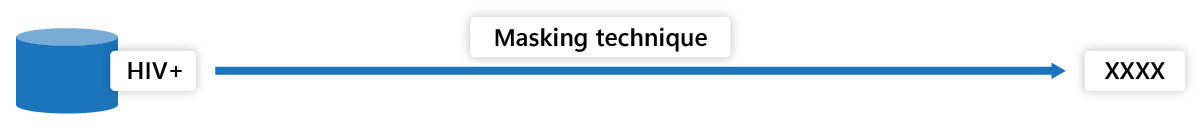
We will continue with the above example. In data masking, you can mask sensitive information like Diagnosis with scrambled or pseudo data. Suppose a patient is diagnosed with HIV+. You can mask that data with “Medical Condition 1” or something similar and protect it from unauthorized access. Here’s a step-by-step approach.
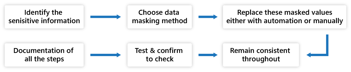
Fig. Data Masking Process
- Find the sensitive information in the dataset. In our example, it is ‘Diagnosis.’
- This process is usually personally identified, like name, contact details, treatments, lab results, and medical condition.
- Choose the data masking method for your dataset. For example, here in our blog, we have used the substitution method. The substitution method replaces the sensitive data with values like ‘XXXX,’ ‘Masked,’ ‘Restricted,’ or ‘Protected.’ There are various methods to choose from.
- Replace these masked values, either with automation or manually.
- Remain consistent throughout to have all the sensitive data replaced.
- Test and confirm to check if all the sensitive data are replaced with their masked values correctly.
- Document why the data is masked in the records and the masking algorithm used. Maintain an audit trail for security purposes.
Another way is to completely replace the sensitive information with random strings or unique identifiers. This is data anonymization. For example, you can replace “HIV+” with “Infectious.” Here’s step-by-step method to anonymize your data-
- Find sensitive information to anonymize.
- Apply a data anonymization technique like generalization method. In generalization, the anonymized data is replaced into broader categories like ‘Infectious.’
- Replace the original value and check for its consistency throughout the data set.
- Validate and test if all the values are obscured for further analysis.
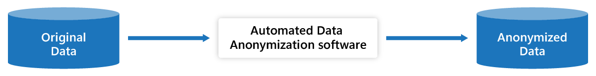
Fig. Data Anonymization
The next question in your mind is, can we use this masked or anonymized data for further analysis? The answer is yes.
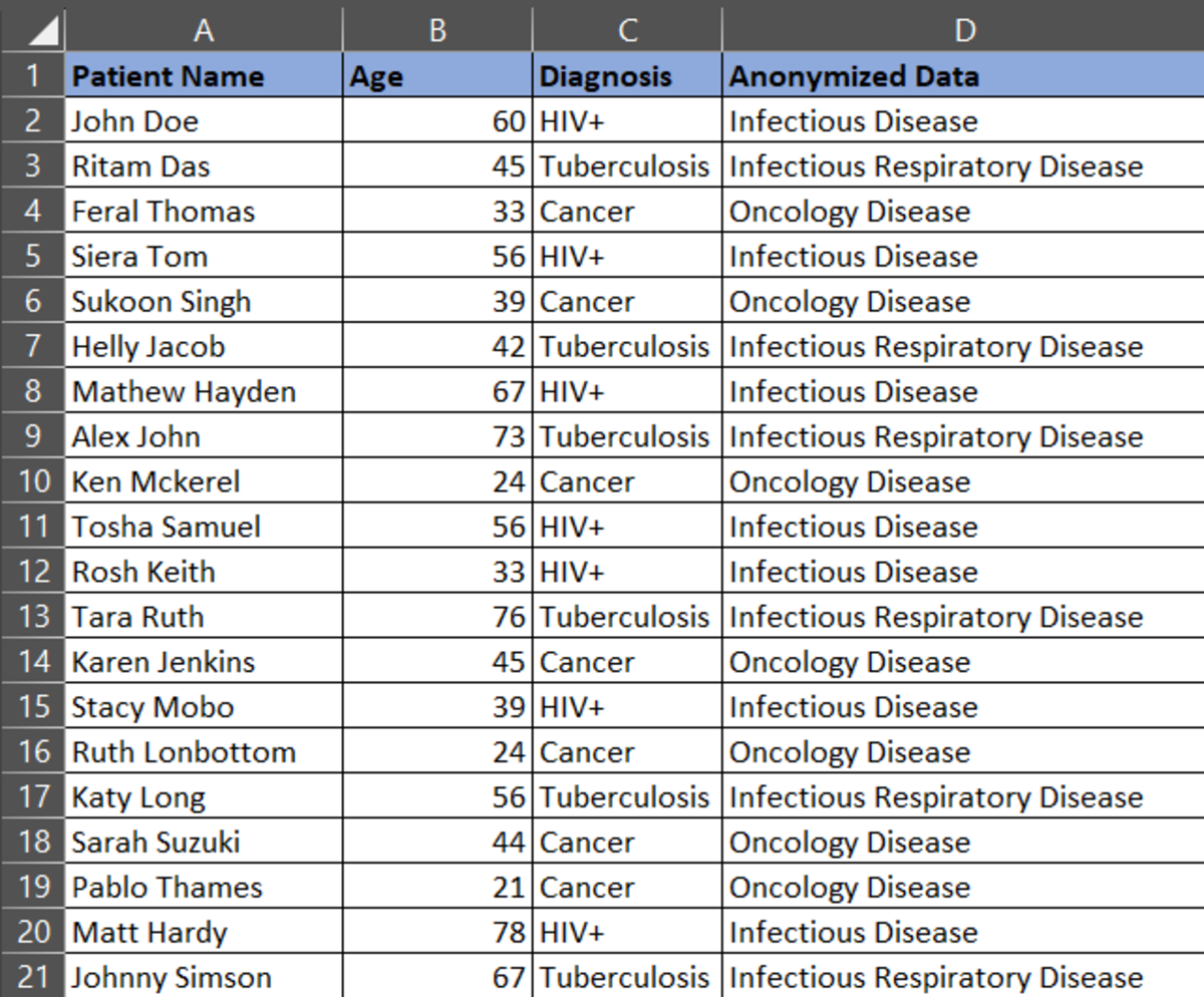
Let’s consider a dataset as below:
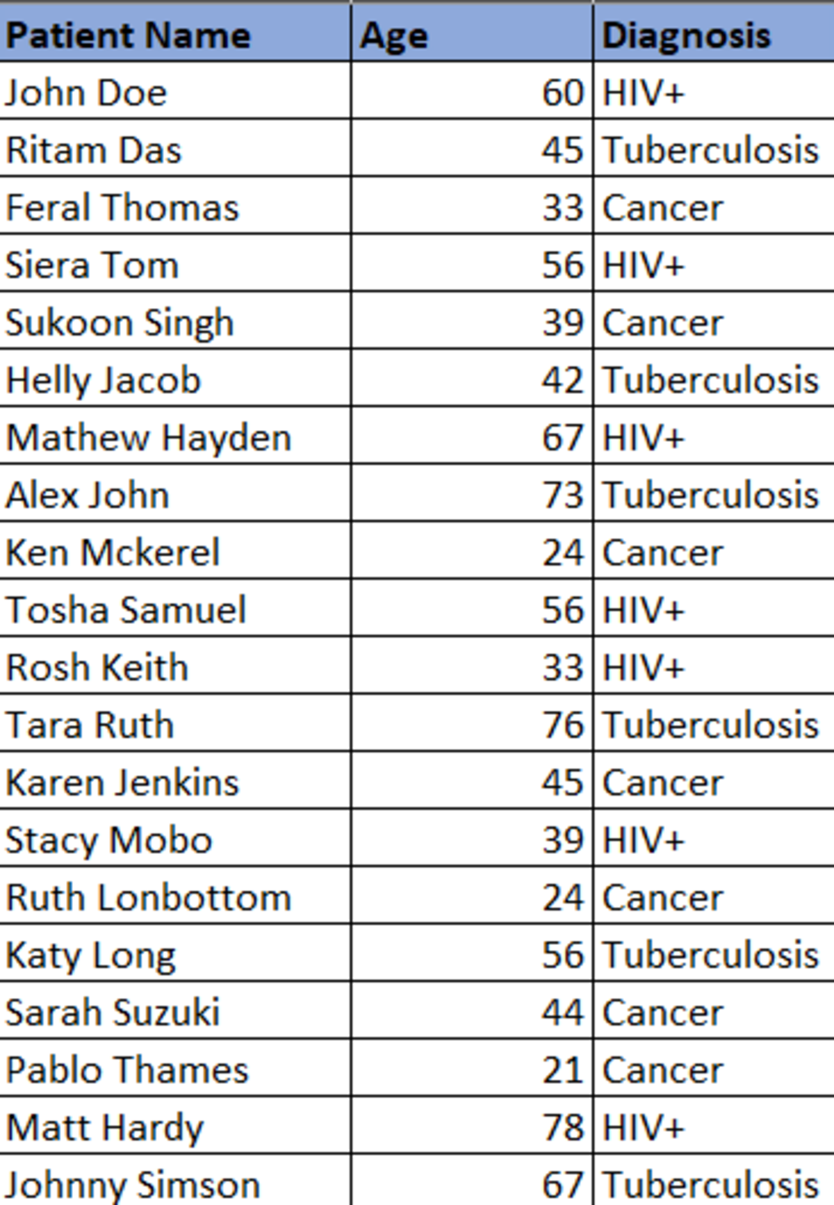
With the data anonymization technique, replace the ‘Diagnosis’ field with the following:
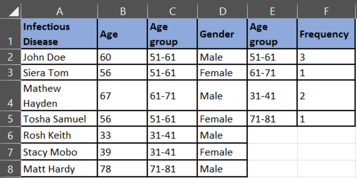
HIV+- Infectious Disease
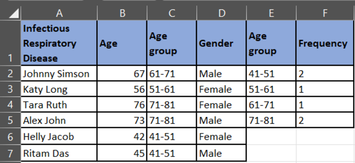
Tuberculosis- Infectious Respiratory Disease
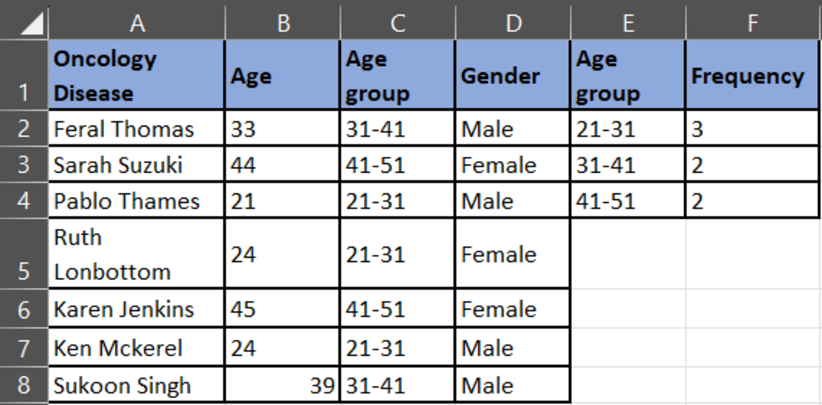
Cancer- Oncology Disease
The new anonymized data set you would get:
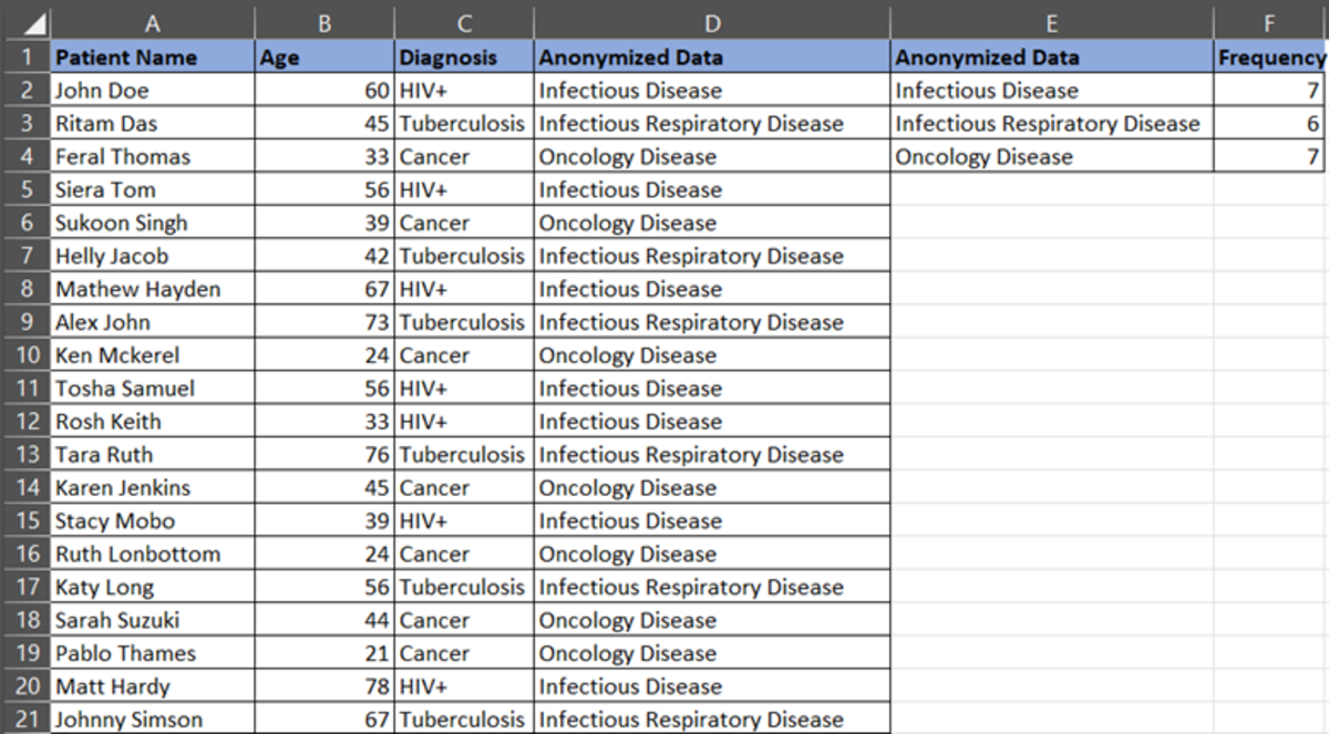
To analyze the data further, we will start with frequency distribution.
We need to count the frequency of the strings. So, we will use the COUNTIF function in Excel. The formula is =COUNTIF (Range, Condition)
For example, you want to know the total counts of “Infectious Disease” in the dataset. Select an empty cell, =COUNTIF (D2:D21, E2) because D2:D21 is the column range you want to analyze and E2 is the column where we have mentioned the condition. The output you will get is as below:
Next, we must calculate the Summary Statistics.
First calculate the Mean, Mode, and Median of the anonymized data. You can calculate the Mean, Median, and Mode using the AVERAGE, MEDIAN, and MODE functions in Excel.
If you see the screen shot below, the mode for infectious respiratory disease is #N/A. The reason is, that there is no repeated occurring value for that disease. Therefore, there will be no mode.
Our anonymized data are-
Infectious Disease, Infectious Respiratory Disease, and Oncology Disease
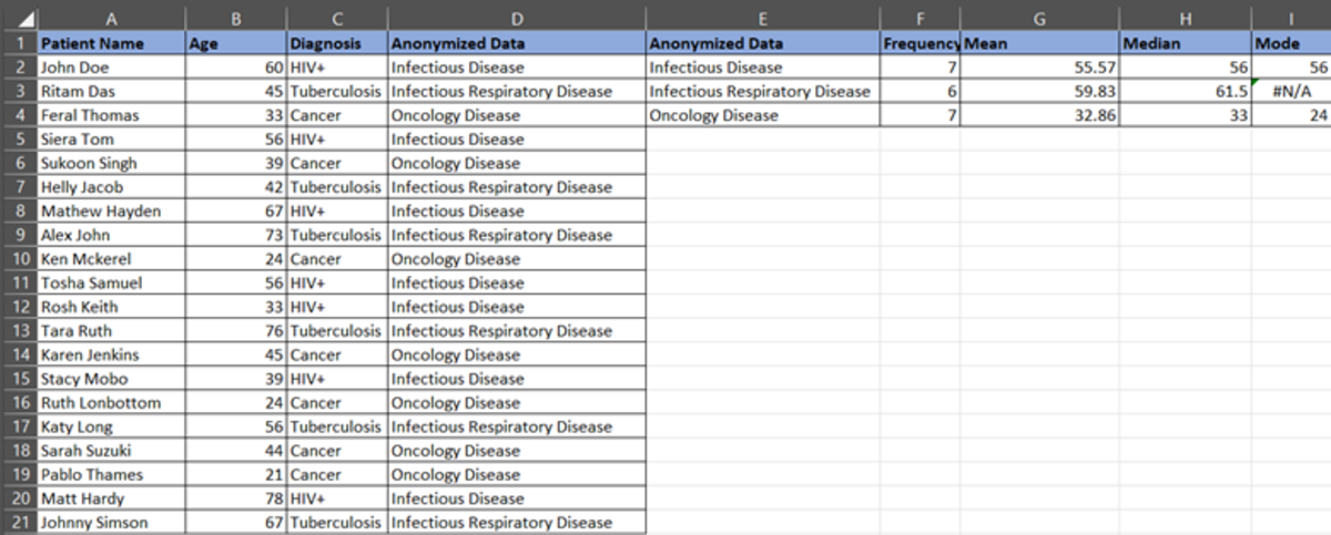
Analysis- 1
Infectious disease has a Mean of 55.57. This means the average age of patients in the infectious disease category is 55.57 or 56 (approx.). Similarly, the average age of patients in the infectious respiratory disease category is 59.83 or 60 (approx.) and in oncology disease is 32.86 or 33 (approx.).
The infectious disease median is 56. It means half of the population having an infectious disease is younger than 56 and half older than 56 in a dataset.
The infectious respiratory disease median is 62 approx. This means half of the population having an infectious disease is younger than 62 and the other half is older than 62 in the dataset.
The oncology disease median is 33. Again, half of the population younger than 33 have oncology diseases, and half of the group is over 33 years old.
If the mode of oncology disease is 24, it means that most of the diagnosed patients are of age 24. Similarly, the infectious disease age is 56, which means most of the diagnosed patients with infectious diseases are 56 years old.
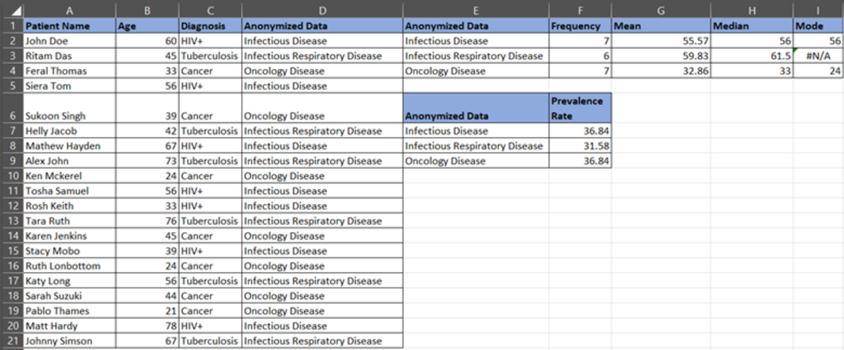
Prevalence Rate
Now, let’s calculate the prevalence of the disease. Suppose there are 7 infectious disease cases out of 20 total cases. Prevalence rate= 7/19= 36.84%. So, we can say that there are 35% of infectious cases in a population.
Similarly, calculate the prevalence of oncology disease and infectious respiratory disease.
Oncology Disease = 7/19 = 36.84%
Infectious Respiratory Disease = 6/19 = 31.58%
Now, let’s analyze the impact and how the healthcare organization must be prepared through the prevalence rate of the disease.
Analysis-2
As we see, both, infectious and oncological diseases are significant in the population. This shows that:
- There’s a higher risk of infections and oncology as most of the population is affected by these.
- Healthcare organizations must distribute suitable resources like medical staff, facilities, medications, treatment plans, and others, very effectively.
- There’s a need for public awareness programs for such high-risk diseases. You must plan vaccines and screening tests for high-risk patients with similar symptoms and address health issues.
- The rise in demand for healthcare services, longer wait times for appointments, and potential strain on healthcare.
- Plan healthcare spending on such diseases. The higher the prevalence of the disease, the higher the burden on the pocket.
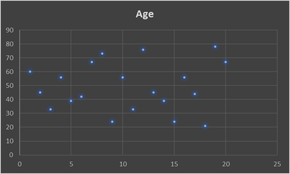
Further, let’s identify patterns in the data.
Pattern-1
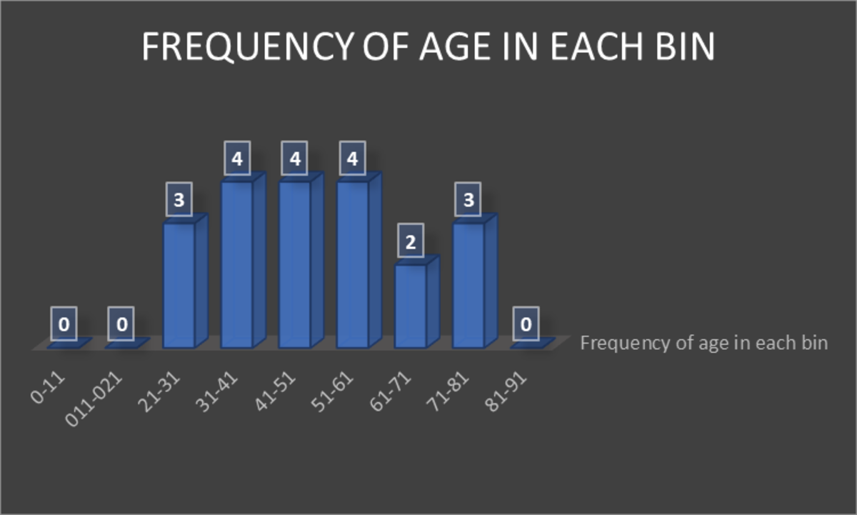
The graph above shows that the age groups (bin) 31-41, 41-51, and 51-61 years are highly affected by various diseases. The next high-impact age group is 21-31 and 71-81 years.
Pattern- 2
Classify the data into the anonymized data as shown below:
Now, plot the graph for each diagnoses category.
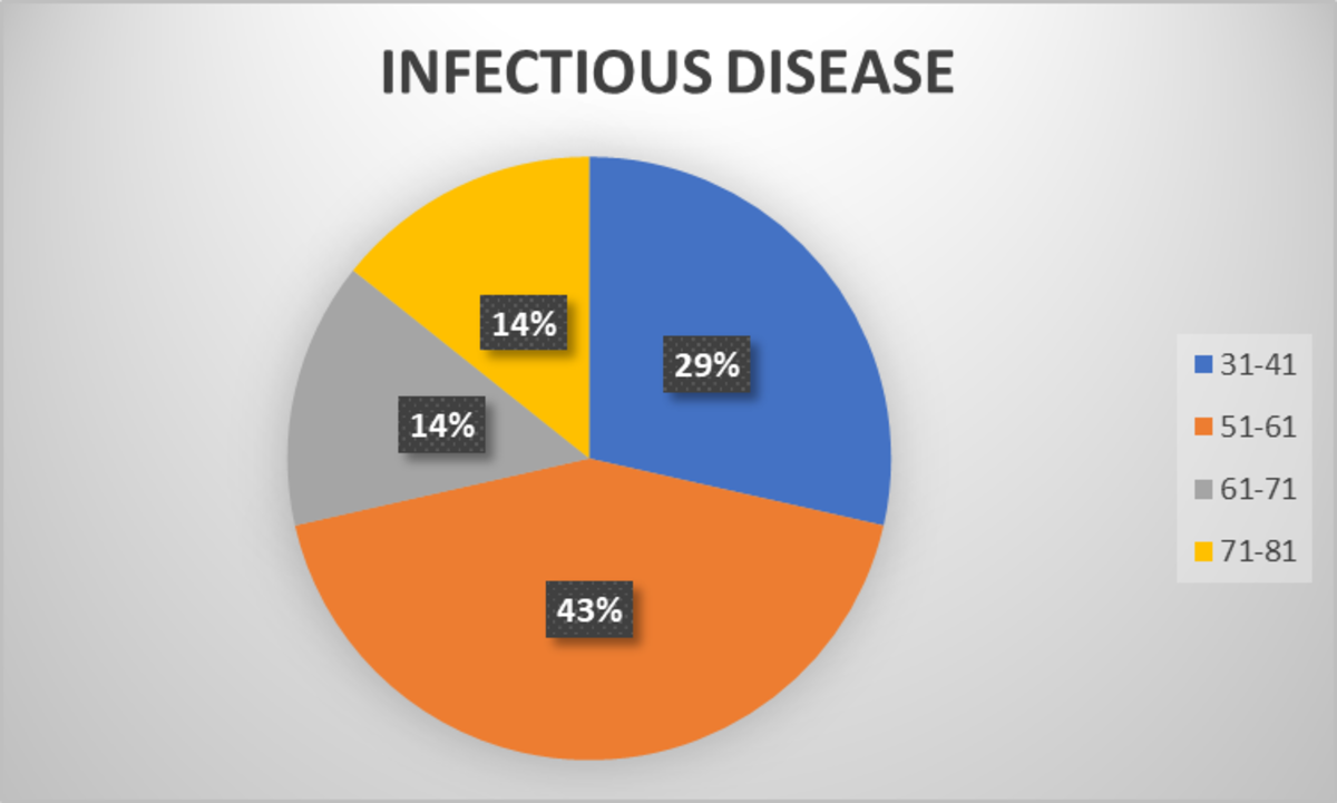
According to the pie chart for the infectious disease category, the age group 51-61 has more patients, followed by the age group 31-41.
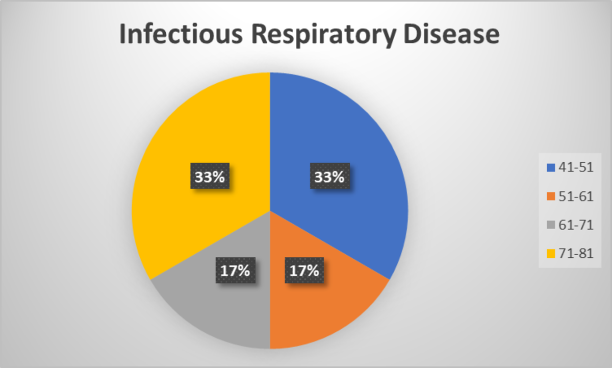
According to this pie chart, the age groups 41-51 and 51-61 have largest patients in this category.
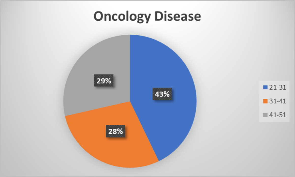
In the oncology disease category, the highest numbers are in the age group of 21-31, followed by 41-51, and then 31-41.
Analysis –3
Identify outliers to check if any of the age data in the dataset is an outlier, i.e. a value far away from the cluster. This shows if the data is mistaken or an anomaly.
Another method to identify outliers is the use of ML algorithms. You can automate this process by implementing an ML algorithm. To learn how to detect outliers through ML, book a consultation with us.
Statistically, you can find an outlier by calculating the z-score. To calculate the Z-score, you must calculate the Mean of each diagnosis, i.e., Infectious Disease, Infectious Respiratory Disease, and Oncology Disease.
Then, you must calculate the standard deviation of each category, and finally the Z-score.
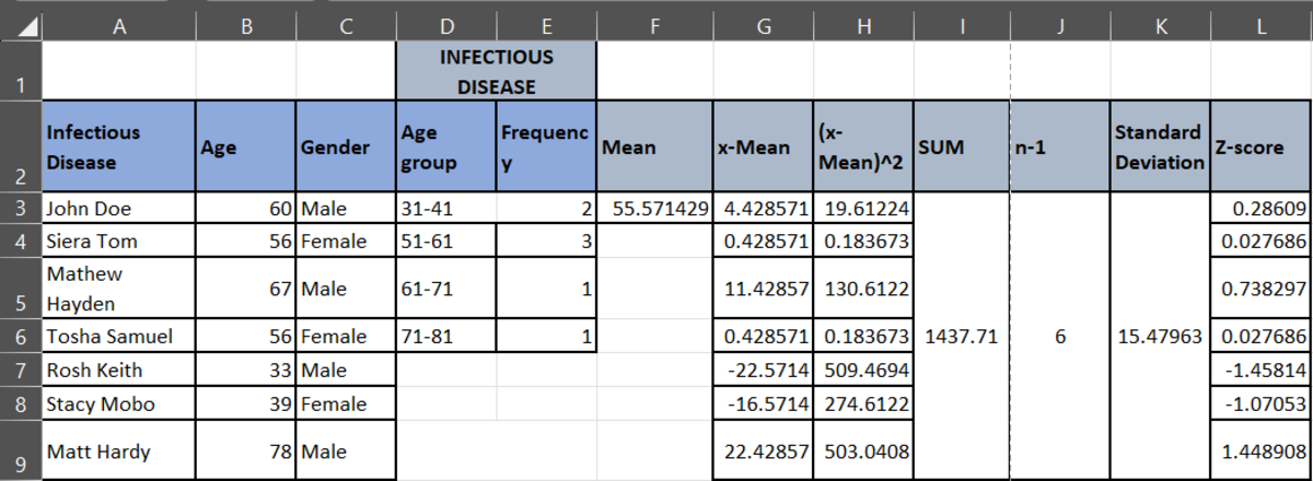
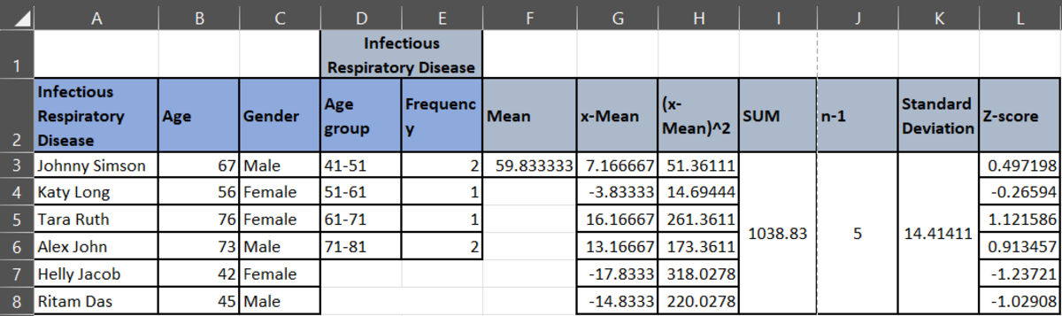
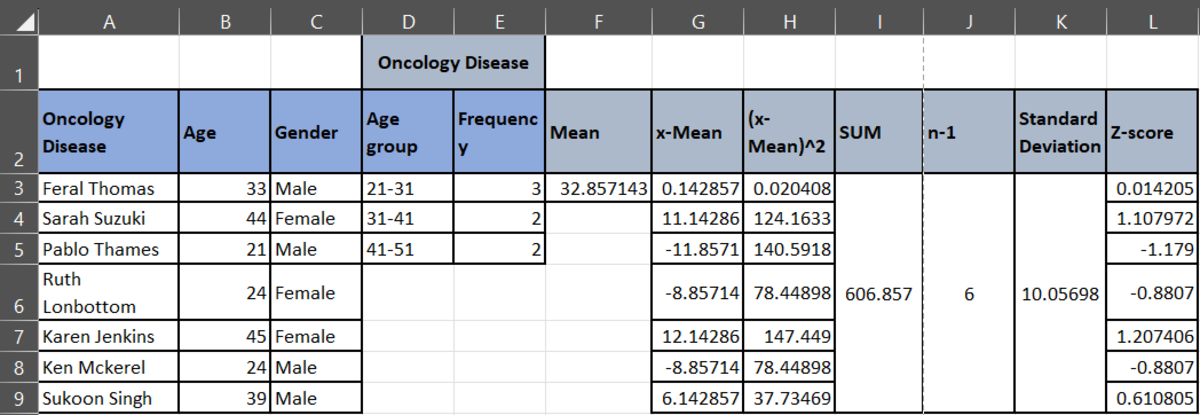
To analyze the data, if the Z-score value is greater than 0, then the data point is above the mean. If the z-score value is less than 0, then the data point is below the mean. If the Z-score is at 0, then the data point is at the mean. If you see all the z-scores, you will see that there are no such outliers that display an extreme deviation from the mean.
To summarize, there’s a lot of BTS while analyzing your secured medical data. So, baffling with so many steps and methods is natural. We don’t blame the brain for getting exhausted. However, what if a data scientist comes in and brainstorms for you? That’s what a healthcare data analytics company like us does. We secure and analyze your massive healthcare data to give you better insights for accurate decision-making. This gives you an extra competitive edge and skyrockets your personalization game. So, better patient care, resulting in loyalty and brand reputation, further resulting in higher revenues! Do you think this sounds like a win-win deal? Then, let’s connect over a call.