Imagine you’re a pharmaceutical executive tasked with optimizing drug development processes and tracking the performance of various drugs in the market. The problem you face is complex data overload. You have mountains of data – clinical trial results, patient data, market trends, and more – but no easy way to make sense of it all. This is where the need for data visualization becomes apparent.

Data visualization is the art of turning raw data into insightful, easy-to-understand visual representations. In the pharmaceutical industry, it can mean the difference between spotting a life-saving breakthrough and missing a critical trend. Therefore, implementing data visualization correctly, brings in benefits like:
1. Data clarity:
Complex pharmaceutical data, such as clinical trial results, patient demographics, and drug interactions, can be overwhelming when presented as raw numbers and text.
Data visualization tools transform this information into visually appealing charts, graphs, and dashboards, making it easier for professionals to grasp key insights.
For example, imagine your pharmaceutical researchers are trying to analyze the effectiveness of a new drug across various patient demographics. Instead of sifting through tables of data, they can use a visualization tool to create a scatter plot that shows the relationship between patient age and drug response. This visual representation makes it immediately clear if there are any age-related patterns in the drug’s effectiveness.
2. Real-time insights:
Pharmaceutical companies operate in an ever-changing landscape where new clinical trial results, adverse event reports, and market trends emerge constantly. Data visualization tools can connect to real-time data sources and update visualizations automatically, ensuring that decision-makers always have the latest information at their fingertips.
For example, your pharmaceutical sales manager uses a real-time dashboard to monitor sales performance across different regions. If there’s a sudden increase in sales in a specific region, the manager can quickly investigate and identify the reasons behind the surge, such as successful marketing campaigns or increased demand due to a recent health crisis.
3. Improved decision-making:
Informed decision-making is paramount in the pharmaceutical industry, where a wrong choice can lead to costly setbacks or, worse, impact patient safety. Data visualization tools empower stakeholders to make data-driven decisions by providing clear insights.
For example, during a clinical trial, your company encounters a sudden increase in adverse events related to a particular drug. By visualizing the data on a safety heatmap, your safety team can quickly identify clusters of adverse events, enabling them to take immediate action, such as pausing the trial for further investigation or modifying the drug’s dosing regimen.
4. Efficient communication:
Effective communication across various departments and with stakeholders is crucial in pharmaceutical companies. Data visualization makes it easier to convey complex findings and insights in a way that is readily understandable to diverse audiences.
For example, your pharmaceutical company is preparing a presentation for investors to secure funding for a new drug development project. Instead of bombarding the investors with technical data and lengthy reports, you can use interactive visualizations to show the drug’s potential market share, projected revenue, and competitive landscape. This visual storytelling not only simplifies the information but also engages the investors, making the pitch more persuasive.
In summary, data visualization is a powerful tool that transforms complex data into visual narratives. So, to leverage its plethora of benefits for your pharmaceutical business and enable professionals to navigate the intricate world of drug development, clinical trials, and market analysis with greater accuracy, confidence, and efficiency, you must know the several steps involved in implementing these tools.
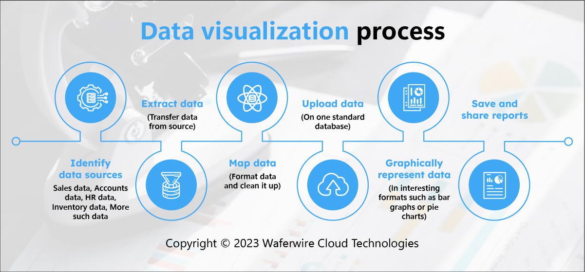
1. Data integration:
Data integration involves the process of connecting various data sources to your visualization tool. This step is crucial because data in organizations often resides in disparate databases, spreadsheets, cloud services, and more.
Data connectors facilitate the extraction of data from these sources and bring it into a central location for analysis. Data integration ensures that your visualizations are based on comprehensive and up-to-date information.
For example, in a pharmaceutical company, data sources may include clinical trial databases, patient records, sales data, and market research databases. Integrating data from these sources allows for a holistic view of drug performance and market dynamics.
2. Data preparation:
Once the data is integrated, it often requires cleaning, transformation, and shaping to ensure its quality and relevance. Data cleaning involves identifying and correcting errors, duplicates, and inconsistencies. Data transformation may involve aggregating, filtering, or joining datasets to create new variables or metrics. Shaping data means formatting it in a way that aligns with your specific analysis needs and objectives.
For example, in a dataset containing patient information, there may be missing values for certain variables. Data preparation involves imputing these missing values or deciding on an appropriate strategy for handling them, such as excluding incomplete records or using statistical methods for imputation.
3. Visualization creation:
The heart of data visualization is creating meaningful and informative visuals from your prepared data. This step involves selecting the appropriate chart types, such as bar charts, line charts, scatter plots, or heatmaps, and configuring them to represent your data effectively. Visualization tools typically provide user-friendly, drag-and-drop interfaces for designing dashboards and reports.
For example, to visualize the effectiveness of different drug formulations over time, you might create a line chart with time on the x-axis and the drug’s performance metric on the y-axis. Each line on the chart represents a different drug formulation, allowing for easy comparison.
4. Sharing and collaboration:
Data visualization is most valuable when it can be shared with relevant stakeholders for insights and decision-making. Many tools offer features for sharing reports, dashboards, or individual visualizations with colleagues, managers, or external partners. Collaborative features enable teams to work together, discuss findings, and make decisions based on the data.
For example, your research team collaborates on a project to identify potential drug candidates. They share a dynamic dashboard that updates in real-time as new data is collected. This allows team members from different departments to provide input and track progress collaboratively.
5. Monitoring and optimization:
Data visualization is an ongoing process. Once your visuals are created and shared, it’s essential to continually monitor their performance and optimize them as needed. This involves reviewing the accuracy and relevance of your visualizations, checking for data updates, and making adjustments to accommodate changing requirements or objectives.
For example, you want to monitor your sales performance through a monthly dashboard. If you notice a sudden drop in sales in a specific region, you investigate the root causes. Perhaps it’s due to supply chain disruptions or market shifts. Then you can modify your visualizations to include these new insights, ensuring your dashboard remains informative and actionable.
In a nutshell, data visualization involves a structured process, including data integration, preparation, visualization creation, sharing and collaboration, and ongoing monitoring and optimization. By following these steps, organizations can harness the power of data to make informed decisions and drive their objectives forward.
Power BI and Tableau: An Introduction
Power BI and Tableau are two prominent players in the field of data visualization, each offering a unique set of features and capabilities.
Power BI is a business analytics service by Microsoft. It enables users to visualize data, share insights, and make data-driven decisions. Power BI is known for its ease of use, seamless integration with other Microsoft products, and cost-effectiveness.
Do you want to check out how Power BI excels for your healthcare data?
Tableau, on the other hand, is a data visualization tool acquired by Salesforce. It’s lauded for its powerful analytics and visualization capabilities, making it a preferred choice for data enthusiasts who crave advanced features and customization options.
Power BI and Tableau: Use Cases
Power BI
Use Case: Quick, user-friendly data visualizations
1. Smaller to Mid-sized Pharma Companies:
- Market Analysis: Power BI is ideal for smaller to mid-sized pharmaceutical companies looking to analyze market trends, sales data, and competitive intelligence. Its integration with Microsoft’s ecosystem, including Excel, SharePoint, and Azure, streamlines data connectivity and reporting.
- Sales and Marketing: Pharma sales teams can leverage Power BI to create interactive dashboards that provide insights into sales performance, customer behavior, and product penetration. The user-friendly interface allows non-technical users to generate valuable reports and charts quickly.
- Clinical Trial Tracking: For companies conducting clinical trials, Power BI can help in tracking and reporting trial progress, patient enrollment, and adverse events. Its simplicity makes it accessible to trial managers and coordinators.
Do you want to create a fab Power BI dashboard?
Tableau:
Use case: Advanced analytics and customization
1. Larger Pharmaceutical Companies:
- Clinical Data Analysis: Tableau excels in handling complex clinical trial data, especially when detailed analysis and visualization are required. It can handle large datasets with intricate relationships and visualize patient outcomes, safety data, and efficacy metrics effectively.
- Drug Development: Large pharmaceutical companies engaged in drug development benefit from Tableau’s advanced analytics capabilities. It can assist in identifying potential drug candidates, optimizing formulation parameters, and conducting in-depth molecular analysis.
- Regulatory Compliance: Ensuring regulatory compliance is crucial for pharmaceutical giants. Tableau’s customization options enable the creation of compliance dashboards, risk assessments, and audit trails tailored to specific regulatory requirements.
- Supply Chain Management: Companies with complex global supply chains use Tableau to gain insights into inventory management, demand forecasting, and logistics optimization. Its ability to handle diverse data sources is advantageous for monitoring the supply chain from end to end.
In Brief:
Power BI is well-suited for smaller to mid-sized pharmaceutical companies that require quick and user-friendly data visualizations. It offers ease of use and integration with Microsoft’s ecosystem, making it accessible to non-technical users. Common use cases include market analysis, sales and marketing insights, and basic clinical trial tracking.
Tableau, on the other hand, shines when advanced analytics and high customization are needed. It is favored by larger pharmaceutical companies with complex data needs, particularly in clinical data analysis, drug development, regulatory compliance, and supply chain management. Its flexibility and scalability make it a top choice for companies dealing with extensive datasets and intricate analytical requirements.
Power BI and Tableau: Characteristics, Cost, and Benefits
- Power BI is known for its simplicity, affordability (particularly for small businesses), and strong integration with other Microsoft tools.
- Tableau offers robust analytics capabilities, a steep learning curve, and a higher price point. However, its customization and scalability make it appealing for larger enterprises.
Choosing the right tool
Data visualization is a game-changer for the pharmaceutical industry, enabling data-driven decisions that can improve patient outcomes and streamline operations.
In the Power BI vs. Tableau battle, there is no one-size-fits-all answer. The choice should depend on your organization’s specific needs, budget, and expertise. Evaluate factors like data complexity, user skill level, and scalability when making your decision. Whether it’s Power BI, Tableau, or another contender, harness the power of data visualization to drive your pharmaceutical endeavors to new heights. Your next life-saving breakthrough may be just a visualization away.