
Imagine you are a mid-sized real estate company grappling with operational inefficiencies, difficulties in identifying property trends, and challenges in predicting market demands.
Executives are inundated with data on property health, occupancy rates, tenant satisfaction, maintenance costs, and market trends, but they lack a streamlined and visual representation of this information.
Traditional spreadsheets and reports make it challenging to discern patterns, hindering quick and informed decision-making.
Enters Power BI.
Power BI, the most buzzed-around data visualization tool, enables organizations to consolidate data from various sources, transforming raw information into visually compelling and easily interpretable dashboards.
With Power BI, real estate organizations can:
- Visualize their entire property portfolio in one comprehensive dashboard.
- Integrate market data and predict future trends.
- Identify areas for improvement and cost-saving opportunities.
- Access a comprehensive overview of the financial performance of each property.
- Have a holistic and real-time understanding of their property management and real estate operations for better decision-making.
In our blog, we will guide you through the step-by-step process of harnessing the full potential of Power BI to enhance your decision-making capabilities and streamline operations.
This blog will help you to:
- Learn how to efficiently load diverse datasets into Power BI. We will be using an Excel datasheet, though. We have a real estate sample dataset that we will be using to elaborate on the steps.
- Clean, reshape, and aggregate data for a clearer understanding.
- Creating visually stunning and interactive dashboards using Power BI.
Let’s get started!
Open your Power BI Desktop application.
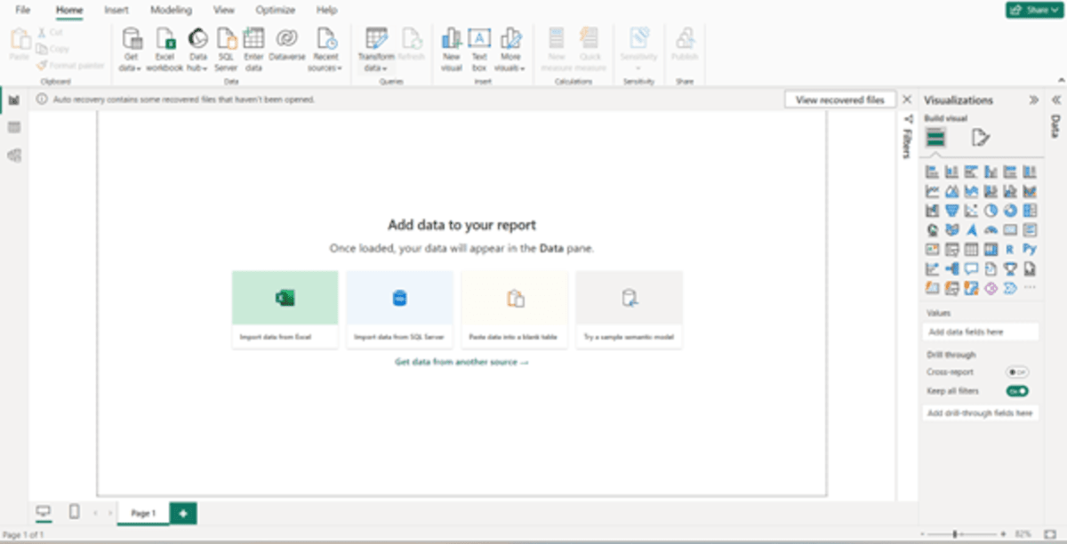
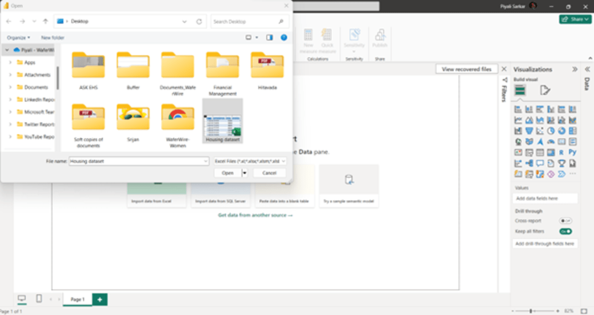
We will select “Import data from Excel” as our dataset is an Excel file and click “Open”.
Wait for some time to get the dataset loaded. Once the data is loaded, you get the following:
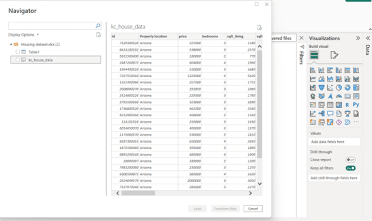
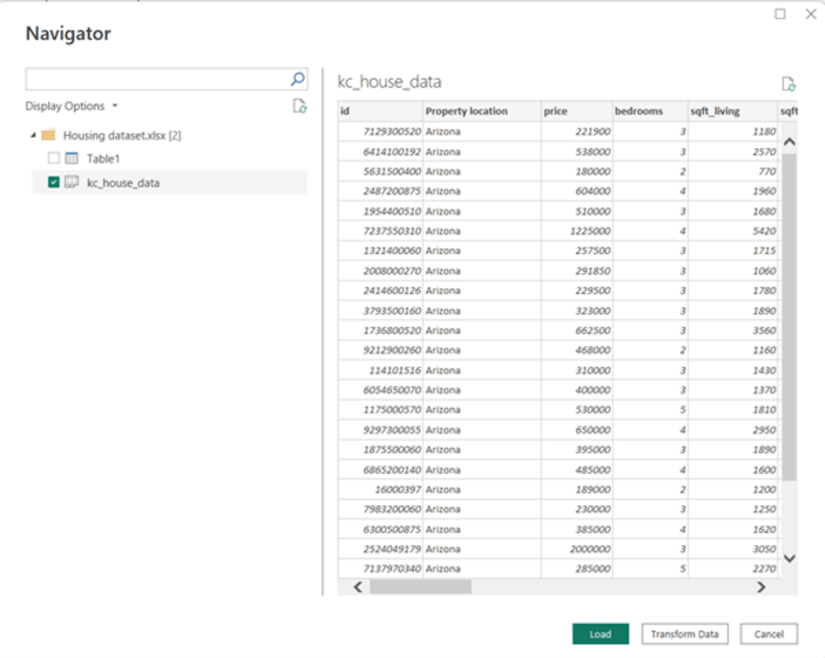
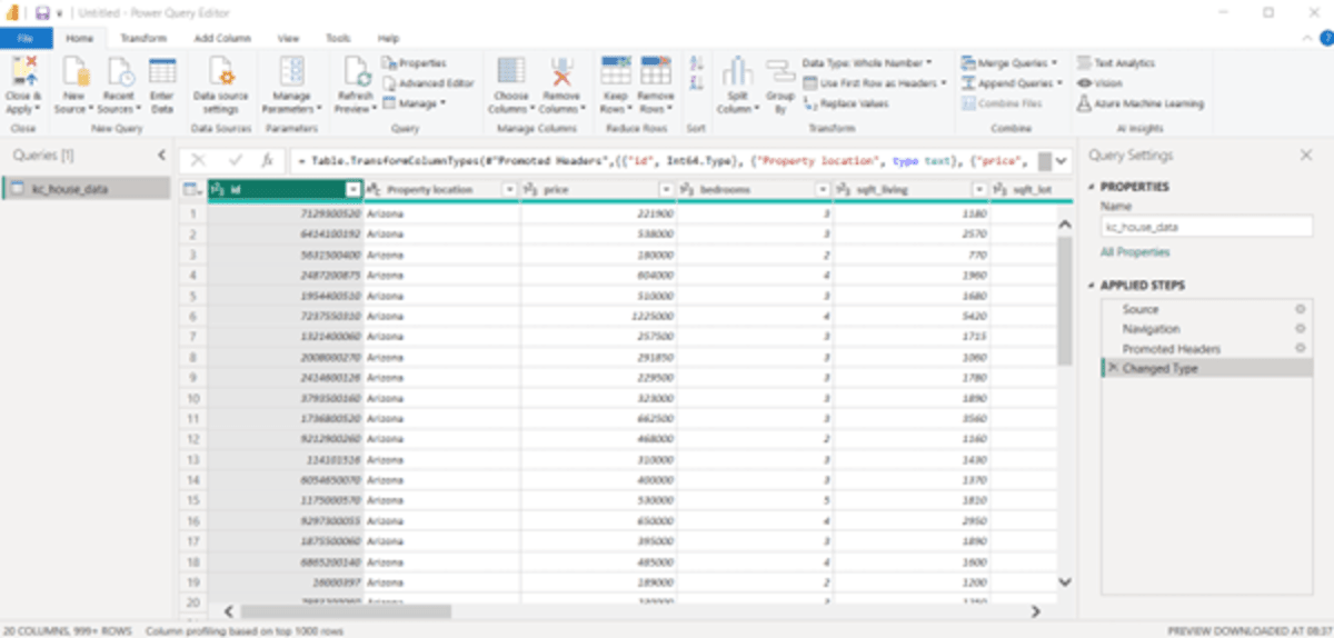
To view the detailed dataset of each, just click on the dataset, for example, “kc_house_data” is clicked.
There are certain data columns that we may not require for creating our dashboard. So, what we can do is check out those columns and remove them. To do this, we need to select “Transform data,” the button that is currently disabled.
To enable this button, check the box for “kc_house_data,” and click on “Transform Data.”
You get the following screen:
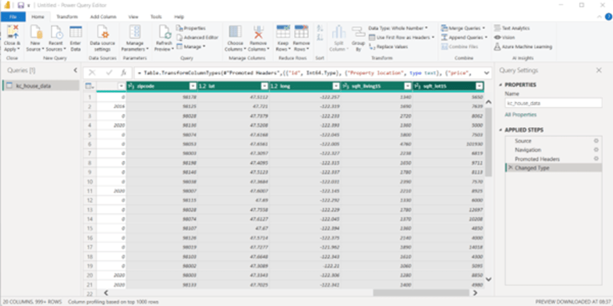
If you scroll to the right, there are columns like, “Zipcode,” “Lat,” “Long,” “Sqft_living,” and “Sqft_lot.” As there’s no need for these columns in our dashboard, we will delete them.
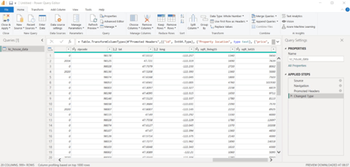
To delete these columns, select them and click “delete” on the keyboard.
The beauty of using Power BI is that the actions you perform on the dataset are recorded in the “APPLIED STEPS” pane to the right.
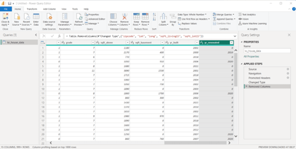
Further, there is no need for columns like, “grade,” “sqft_above” and “sqft_basement.” Select these columns in the database (Ctrl + click) and click “delete” on the keyboard. 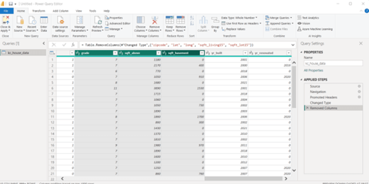
Further, we will delete a couple more columns to clean the dataset with the steps mentioned above. From our sample dataset, we will delete columns like, “view,” “sqft_lot,” and “id.”
Now, if you see the column “bedrooms,” it is not in the right format. Usually, when we talk about a property, we say, “2BHK”, “3BHK,” or 3 Bedrooms with a hall and kitchen. So, to transform the existing data, select the column “bedrooms” –> Click on the “Add Column” tab –> Click “Column for Examples”
A new column will be added. Name the column “Bedrooms.” The first data of the original “bedrooms” column was 3. Enter the same data in the new column and add bedroom(s) with it. The reason we are adding bedroom(s) is because there are properties that can have 1 bedroom as well. Click “Ctrl + Enter.”
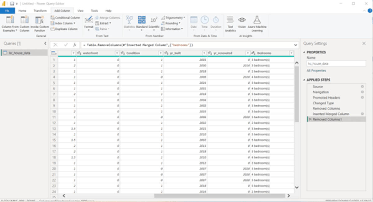
Delete the original “bedrooms” column.
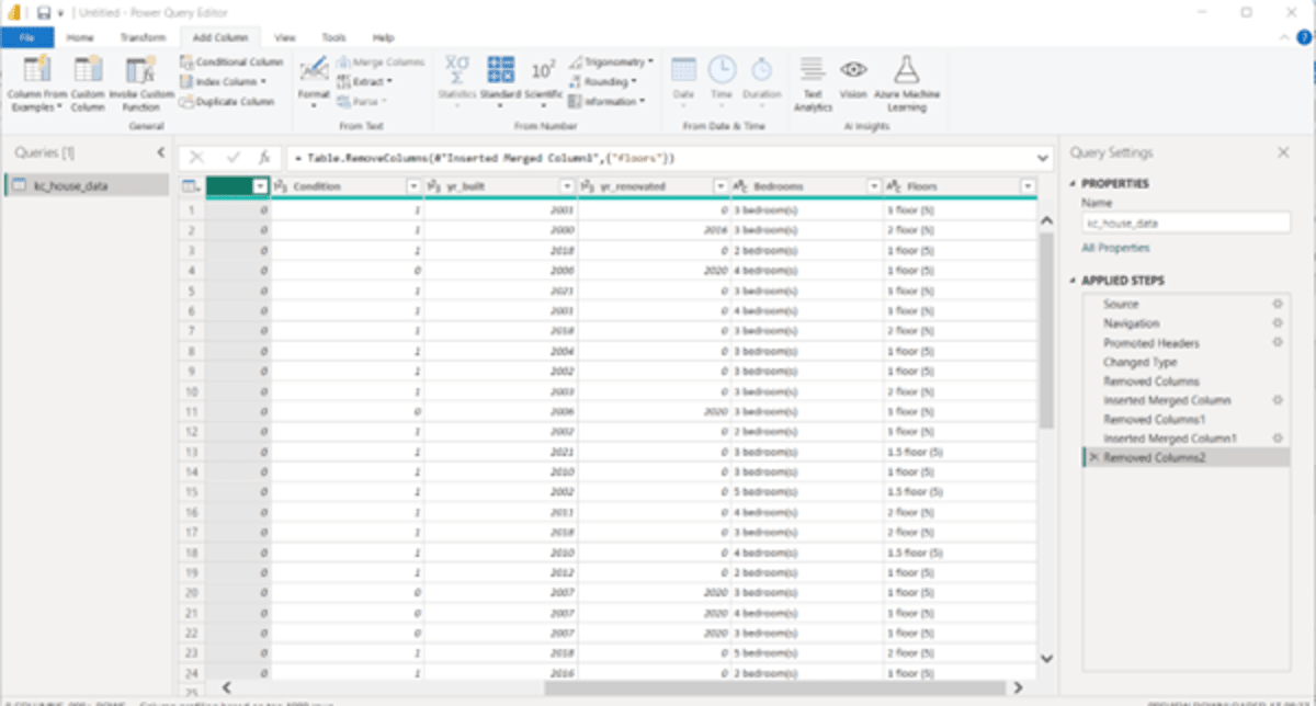
We will repeat this process for the column “floors” as well.
So, to transform the existing data, select the column “floors” –> Click on the “Add Column” tab –> Click “Column for Examples”
A new column will be added. Name the column “Floors.” The first data of the original “floors” column was 1. Enter the same data in the new column and add floor (5) to it. The reason we are adding floor (5) is because the properties have 5 floors and the entered property, say 1 is 1st floor out of 5. Click “Ctrl + Enter.” Then, take off the old column “floors.”
Now, there is a column “waterfront” which we can consider to be a conditional one. To apply condition to this column, you need to:
Select the “waterfront” column –> “Conditional format” from the Add Column tab
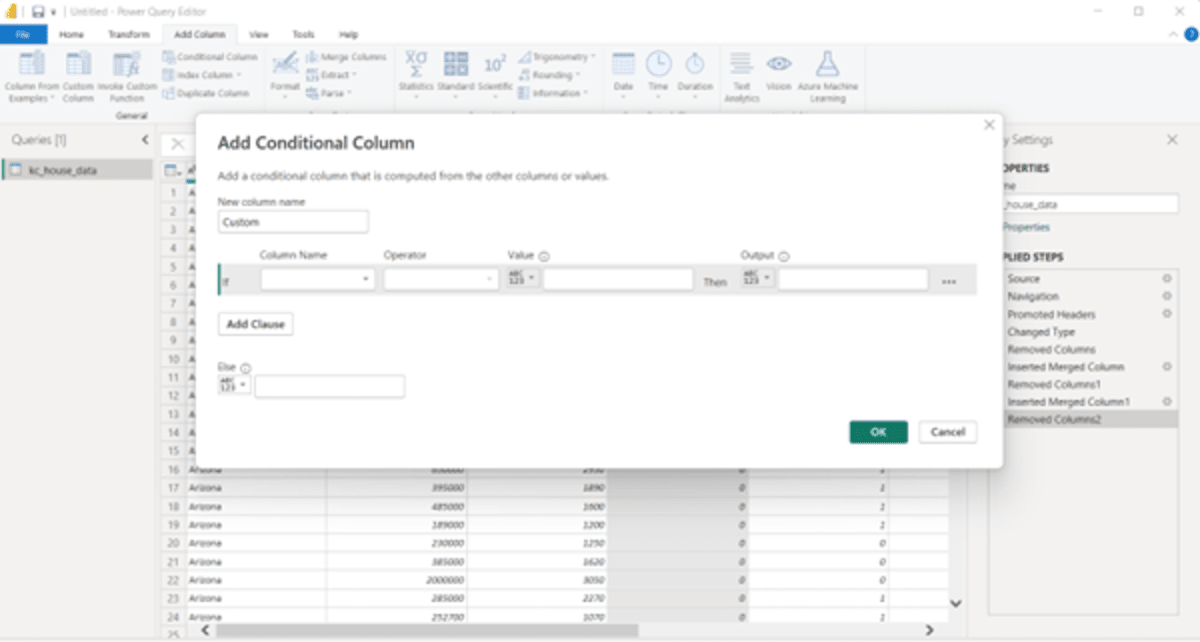
In the “New column name” write “Waterfront Status” as we want to apply the condition to this field. From the drop-down of the “Column Name” field, select “waterfront.” The “Operator” field by default appears to be “equals.” We will enter the value as “1” and Output as “Yes.” So, the condition comes as, if the waterfront value = 1, then the output will be Yes, else it will be “No.”
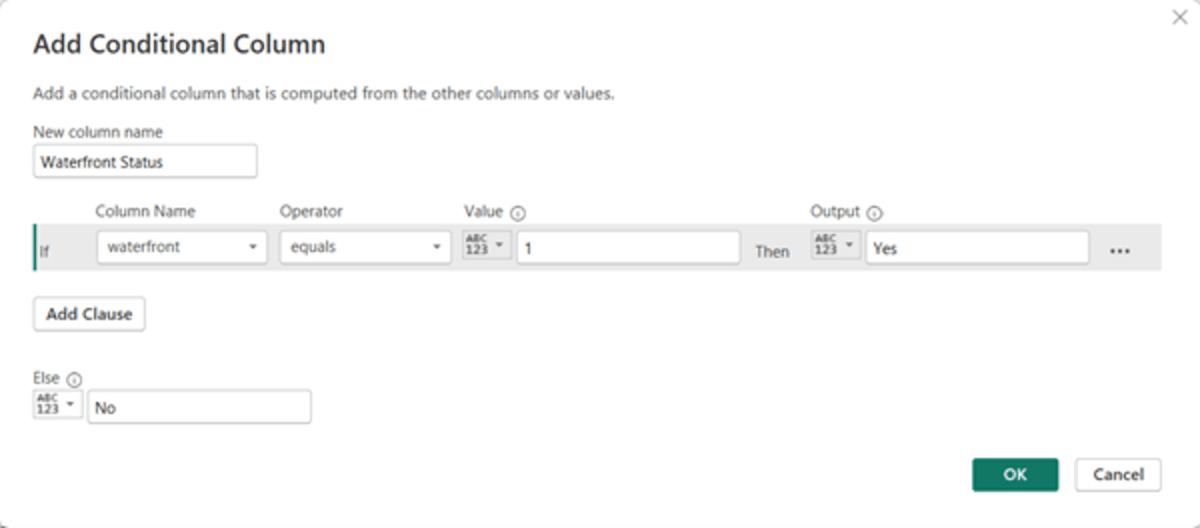
Click on “OK.” So, now you have the new “Waterfront Status” column as below:
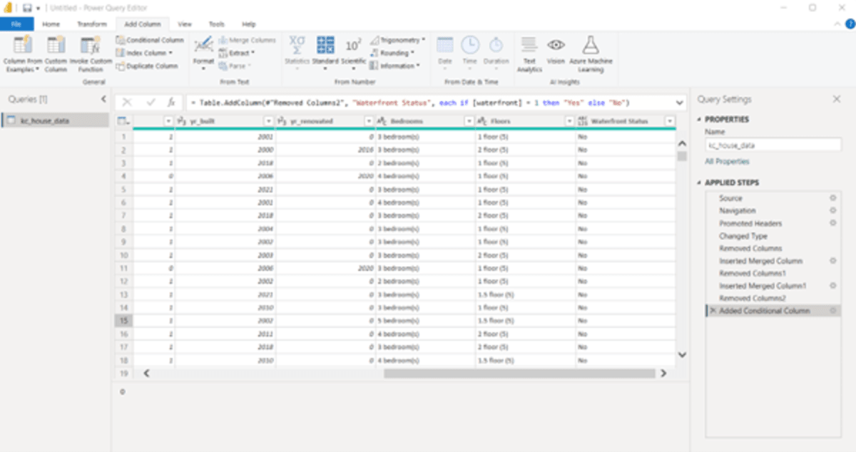
Delete the old “waterfront” column from the dataset.
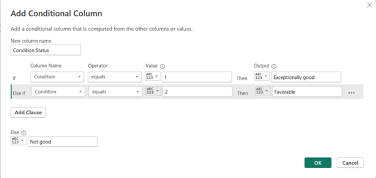
Now, if you see the dataset, there’s a column “condition.” You might be thinking what this may represent. The condition here is the health status of the properties listed in the dataset. If the condition = 1, it means, the property is in exceptionally good condition. Likewise, if the condition = 2, it means, the property is in favorable condition, and if it is 0, then the property is in a bad condition.
To transform this condition column, let us follow the previous steps that we did for the waterfront column. Now, if you see, there’s another clause added after the first condition. This can be done by clicking on “Add Clause.”
The steps are as follows:
- Select the “Condition” column –> Click on “Conditional Column” in the Add Column tab.
- Add Conditional Column window pops up.
- Write “Condition Status” in the “New column name.”
- In the “Column Name” field, select “Condition” from the drop-down menu as we want to put conditions in that field. The Operator field will be set to “equals” by default. Add 1 to the “Value” field, and “Exceptionally good” to the “Output” field.
- Click on “Add Clause.”
- In the Else If field, “Condition” will appear by default. The Operator field will be set to “equals” by default. Add 2 to the “Value” field, and “Favorable” to the “Output” field.
- Now, since we are using just three values, 0,1, and 2, we will not add any more clauses to this. So, in the Else field, write “Not good.”
- Click “OK.
After clicking “OK,” you get the following–
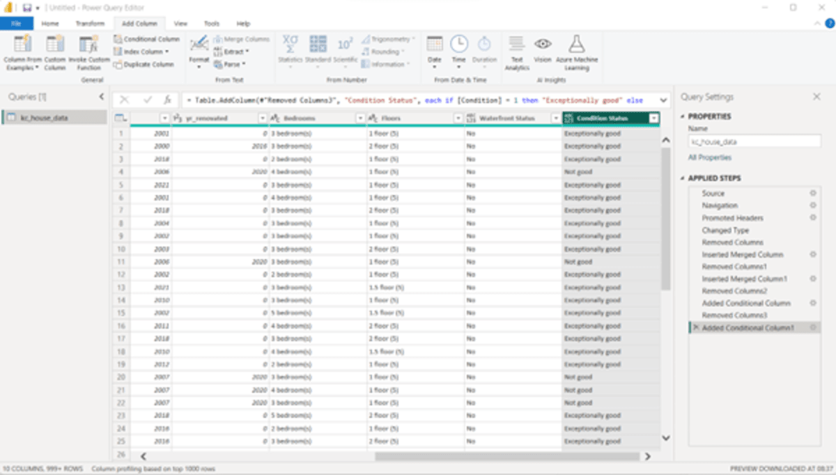
Now, as we have the data in the right format, you can delete the older one.
The dataset has two columns that show the year the property was built, and the years when the properties have been renovated. However, we do not have a column that shows the total years between the properties built and renovated. Also, as we have a considerable amount of data. So, to understand the total number of properties that were renovated, and which were not, a high-level view would be required. So, let us start adding these columns.
First, let us add a column that would highlight the total number of years between the properties built and renovated. The steps are as follows:
- Select the “yr_built” column –> Custom Column from the Add new column tab. A popup “Custom Column” appears as shown below.
- In the “New column name,” write “Interval” as the column represents the interval between the two columns. You can choose the most suitable name.
- Now, to know the interval between the year the property was built, and it was renovated, you need to subtract the year the property was built from the year of renovation. So, in the Custom column formula, you need to add the formulas that were just mentioned in the earlier statement. From the Available columns pane, select the column “yr_renovated” and click “Insert” then use “-” symbol from the keyboard, and again select “yr_built” and click “Insert.” Now, click OK.
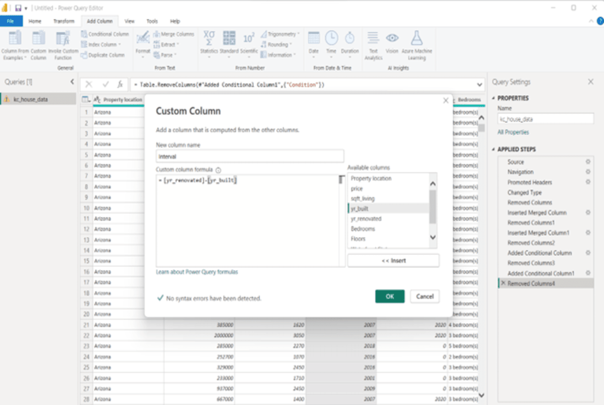
After clicking “OK,” you get the following column-
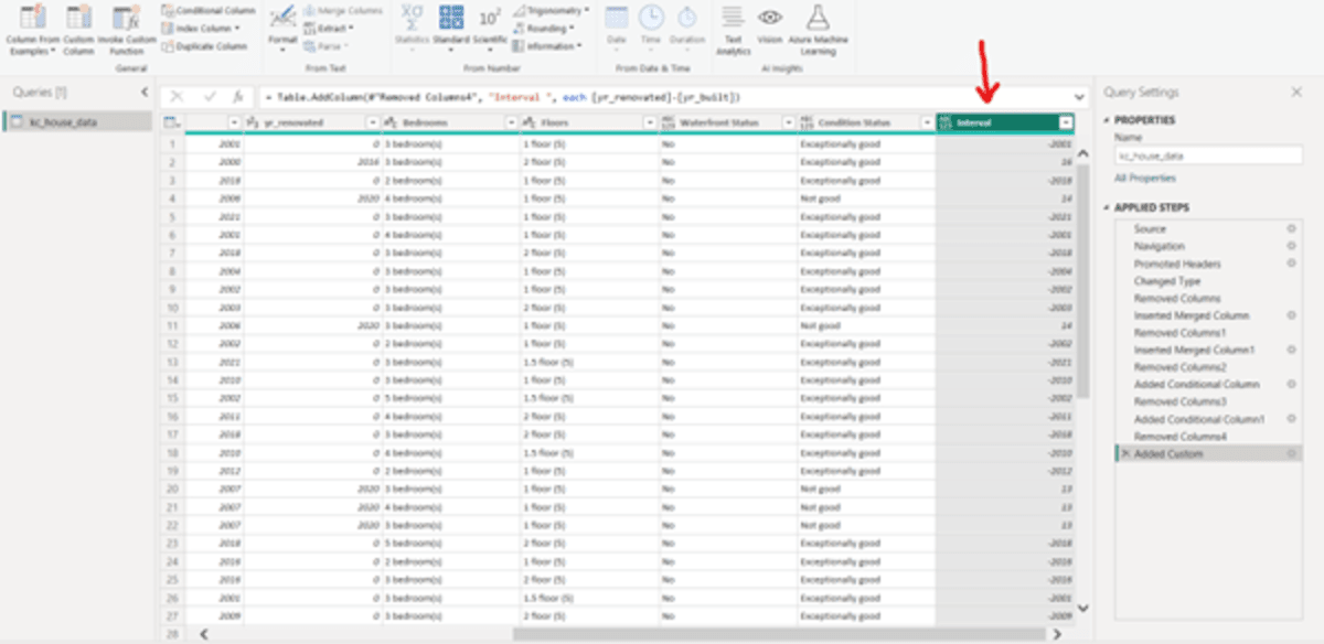
Now, we need to have a high-level view of the renovation status.
To get that conditional column, follow the steps below:
- Select “Interval” –> Select “Conditional Column” from the Add Column tab.
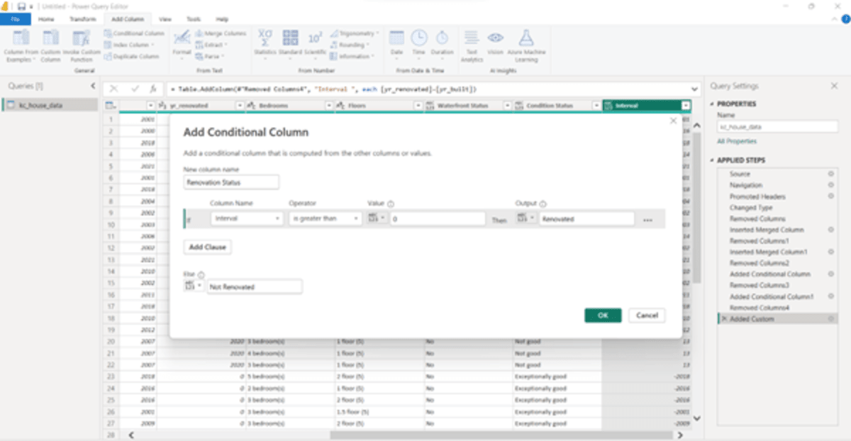
- As we want to know whether a property is renovated or not, we will name the new column “Renovation Status.” Because we want to apply this condition on the interval field, select “Interval” from the drop-down menu.
- Now, getting back to the dataset, you will find that the “Interval” column has many negative values. The reason is some of the fields in the yr_renovation column are 0, representing that these properties were not renovated. So, to apply a condition, we will use the Operator as “Greater than” and the Value as “0.” If the Interval is > 0, then the Output will be “Renovated,” else “Not Renovated.”
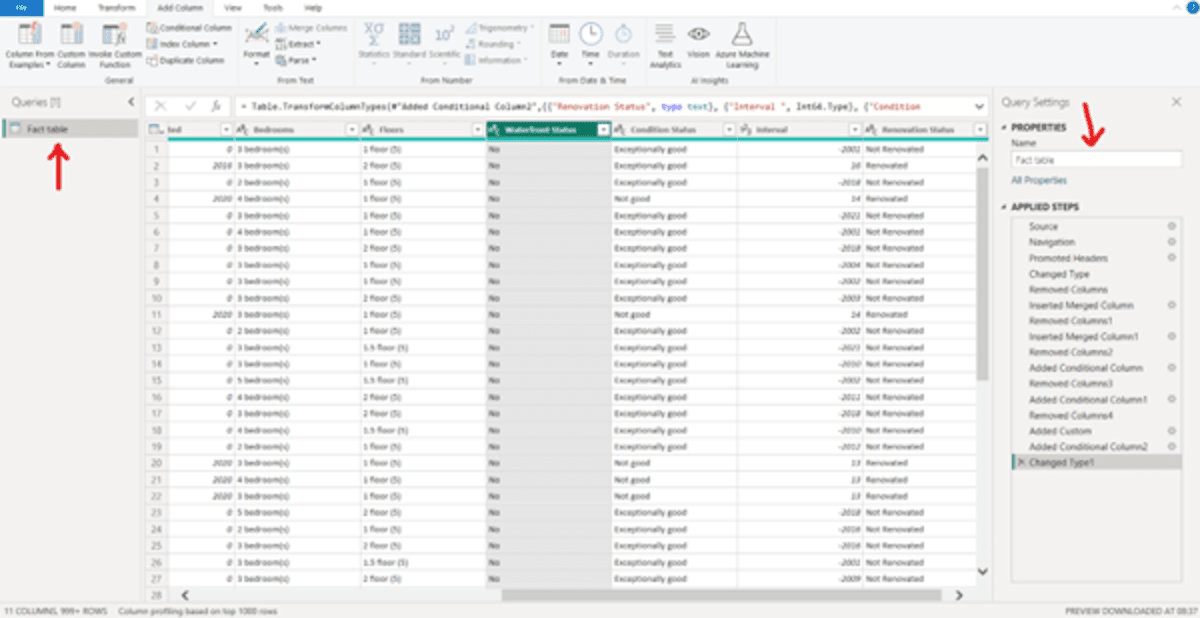
- Click “OK.” You get the following column:
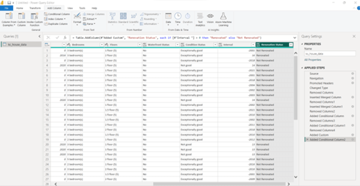
Now, check the datatype of each column and change accordingly.
For example, if you see the screenshot above, the datatype for the column “Renovation Status” is ABC & 123. This is a text field. Therefore, click on ABC & 123 –> select Text.
Similarly, you must change the interval column, which will be a whole number, and so on.
Now, to make visualizations user-friendly, let us create separate tables for all.
To do this, follow the steps below:
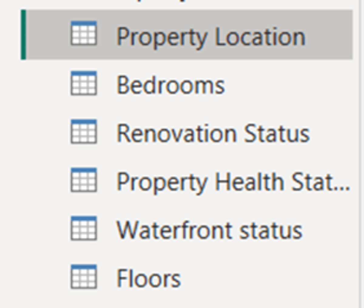
- Rename the dataset as “Fact table.” This can be done in the Properties pane.
- Right-click on “Fact table” in the Queries pane –> Select Duplicate–> Rename to the first field of the dataset or relevant to it. For example, the first field is property location. We will label it as “Property Location.”
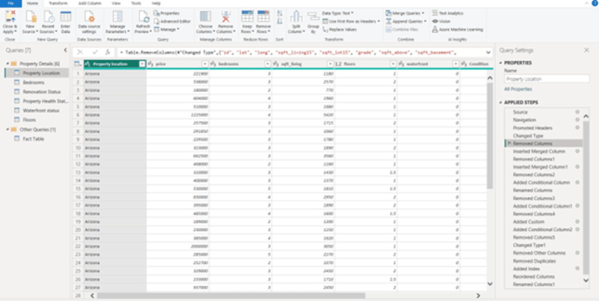
- Now, we want only the first column, which is the property location. So, select the column, right-click on it, and select “Remove other columns.”
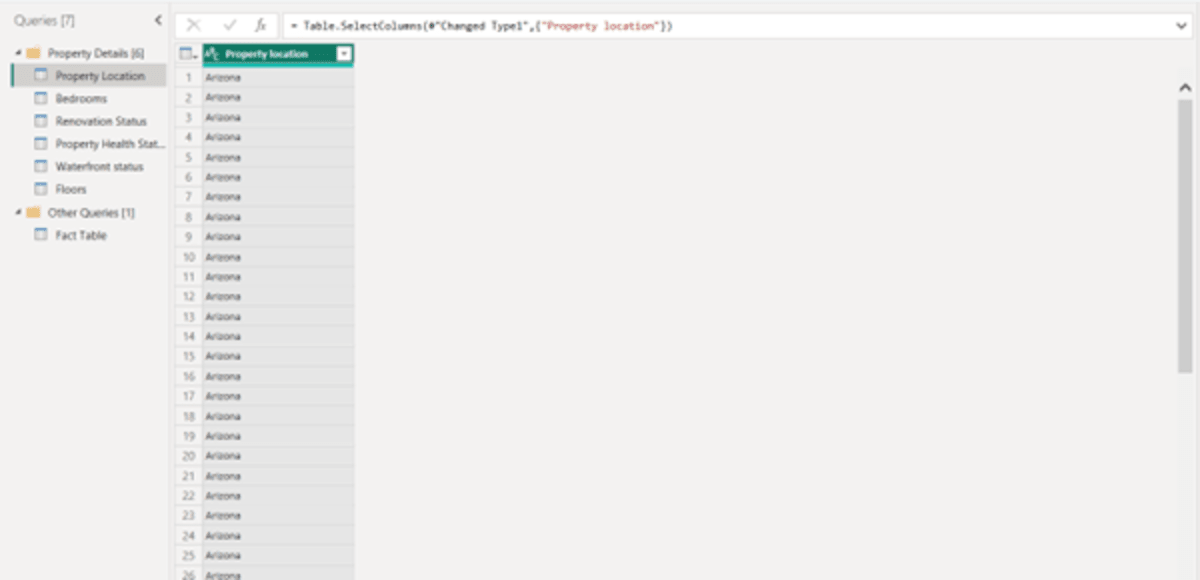
- Now remove duplicates from the column. For that, right-click on the property location column and select remove duplicates.
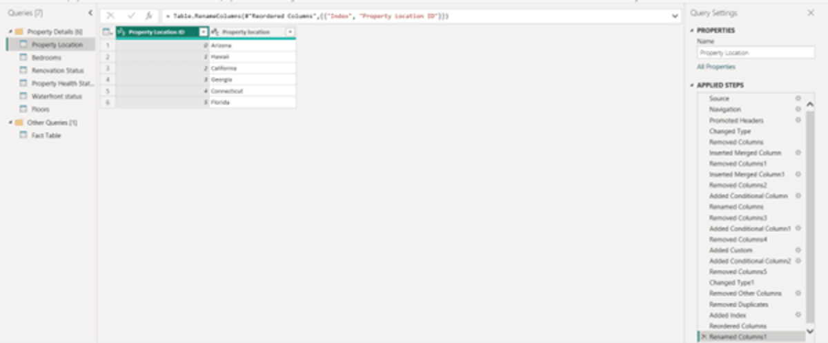
- Add an index to the Property location column. To add, select the column, “Index column” from the Add Column tab, and select “From 0.” The index table will appear to the right of the property location column. Just drag it to the left of the property location column.
Repeat all the steps to create a separate table for each column.
Note: Every time, create a duplicate of the Fact table to create a new table.
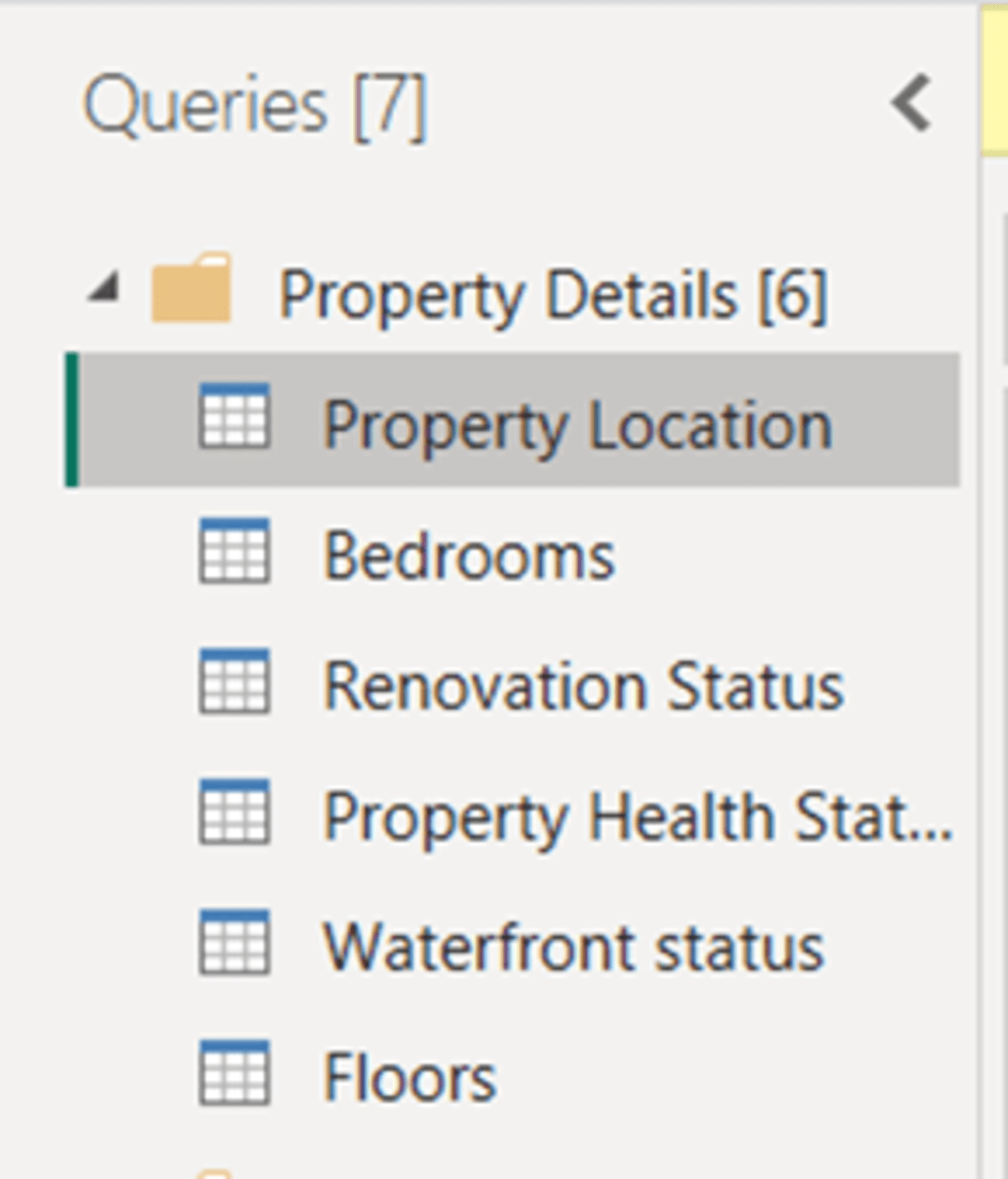
After creating separate tables for each, you will have the following screen:
Now, group these tables. To do so, right-click anywhere in the blank space in the Queries pane–> Select “New Group” –> Enter the name of the Group. Here we have taken “Property Details” –> Click “OK”
After the new group is created, shift the tables to the new group. Right-click on the table you want to move, for example, “Property Location –> Select “Move to <Created Group name>, for example, “Move to Property Details.”
After moving all the required tables in this group, you will get the following screen:
Now we need to connect these tables to the fact table. The reason we are doing this is to maintain and scale the database without hampering its performance.
To do so, follow the steps below:
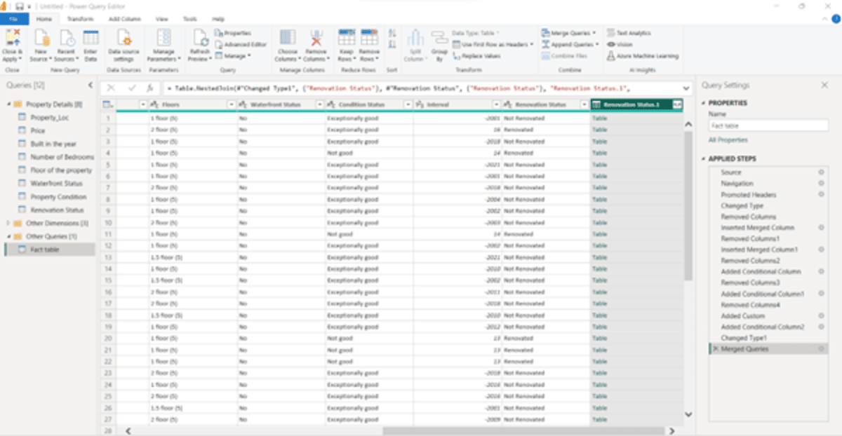
Open the Fact table –> Select the Column you want to merge, say “Renovation Status”–> Go to the Home Tab –> Select Merge Queries –> A pop-up appears as shown below –> Select “Renovation Status” as we are merging the renovation status column with the table separately created for this.
We get the screen below:
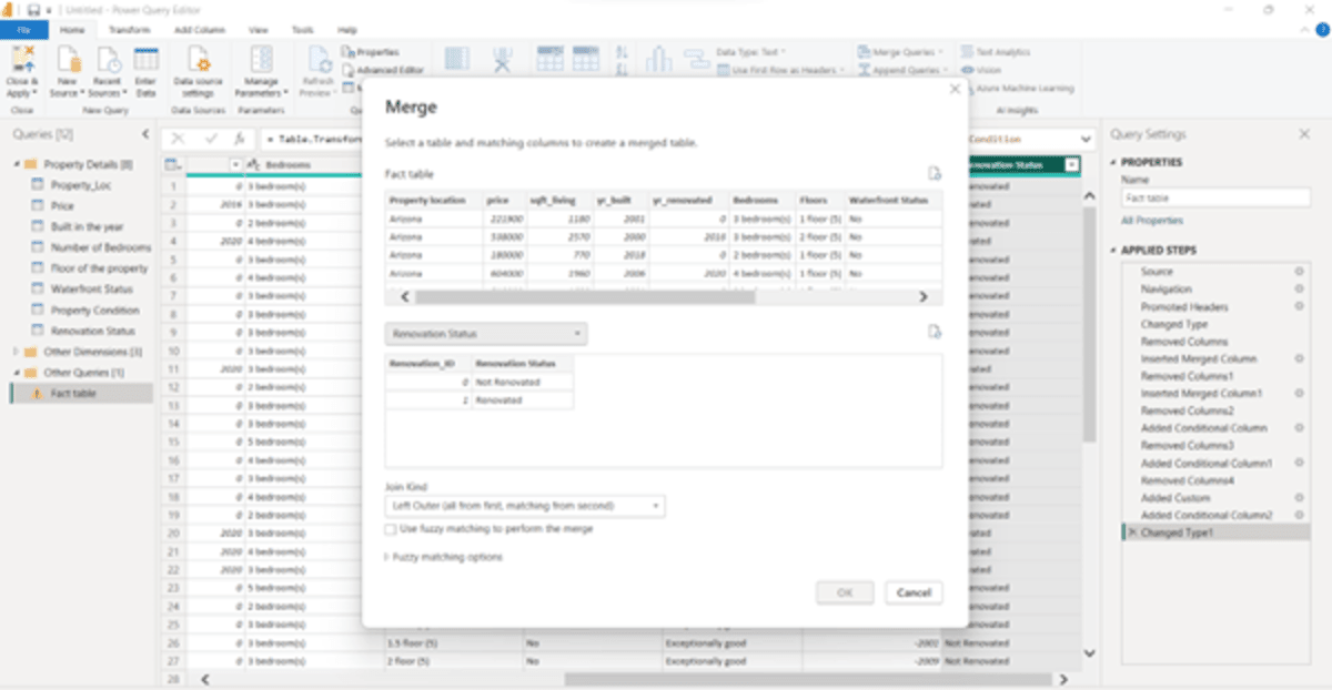
Now select “Renovation Status” from the Fact table and select the Renovation Status from the one with Renovation_ID.
Click “OK.”
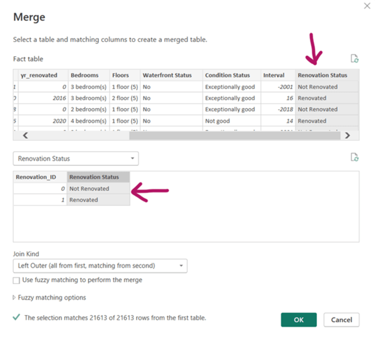
You will get the following screen:
To convert this, click the symbol as shown below:
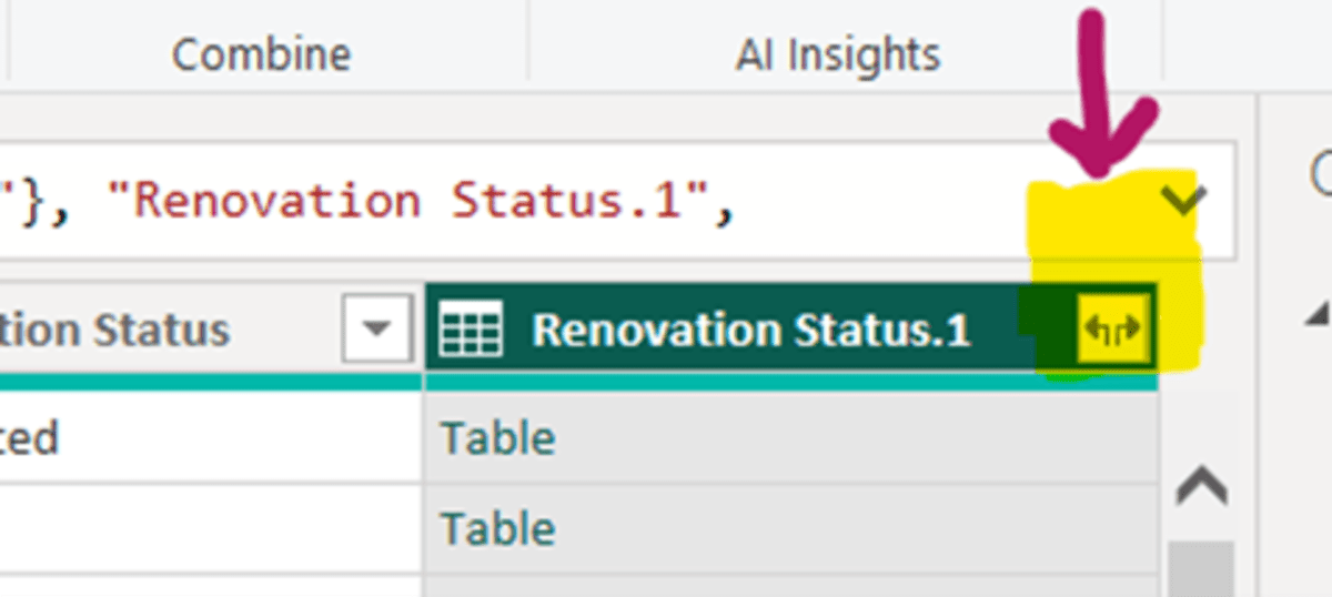
You will get the screen below:
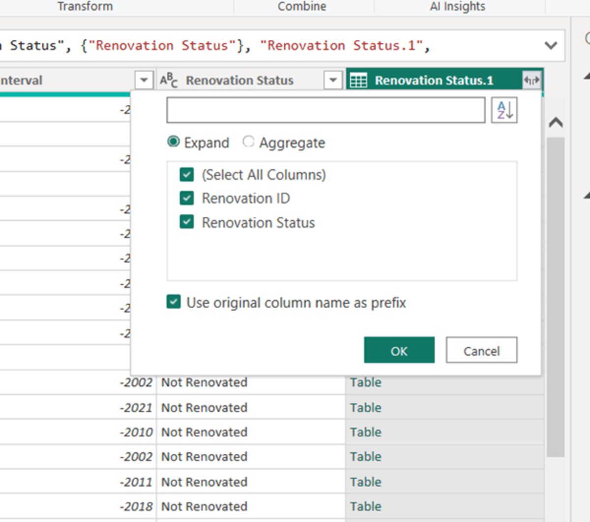
Unselect all the checkboxes. We will need only the Renovation ID. So, select only that field, and Click OK. You will get the following screen:
Now repeat this process for all other tables. Once you do it for all, you’ll get the screen below:
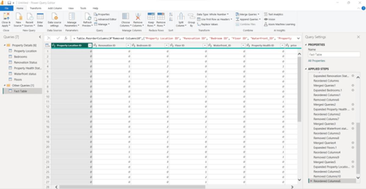
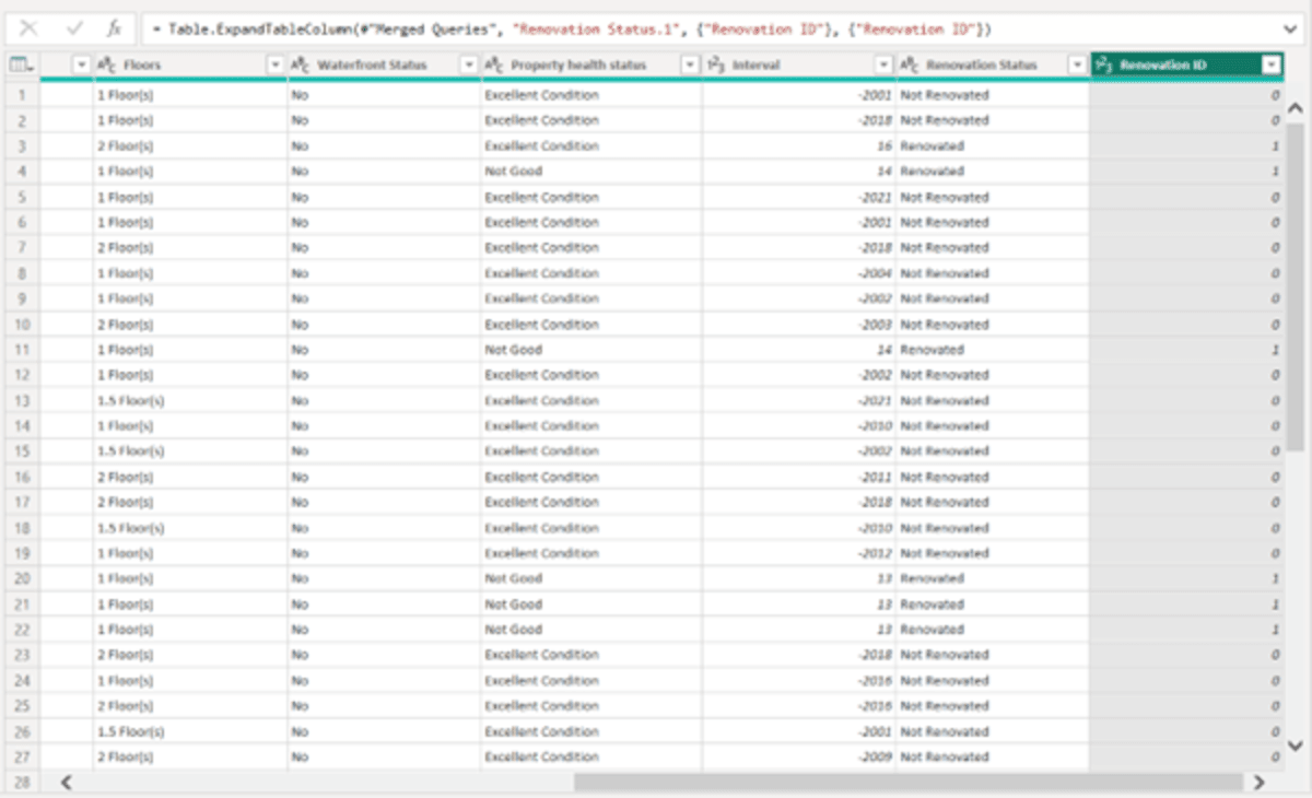
We have shifted the IDs to the beginning of the table and removed the original columns. For example, we merged and connected Property Location with the Fact table and inserted the Location ID column. Once we have inserted the location ID from the Property Location table, delete the original property location column. Repeat the same process for all the other tables.
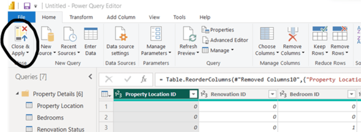
Now, we have cleaned the entire dataset. Click on “Close & Apply” in the File tab.
After you click, you will get:
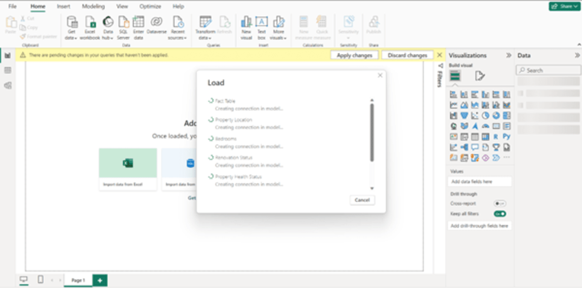
Once all the data is uploaded, the tables that you worked on will appear in the data pane to the right.
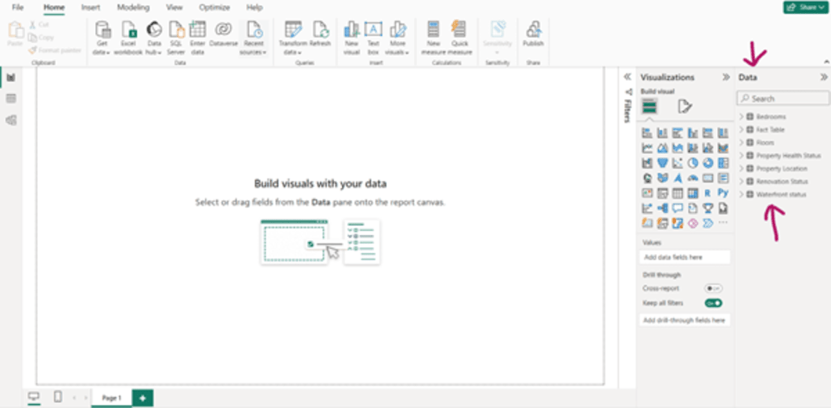
Now, let’s start building visuals with your data.
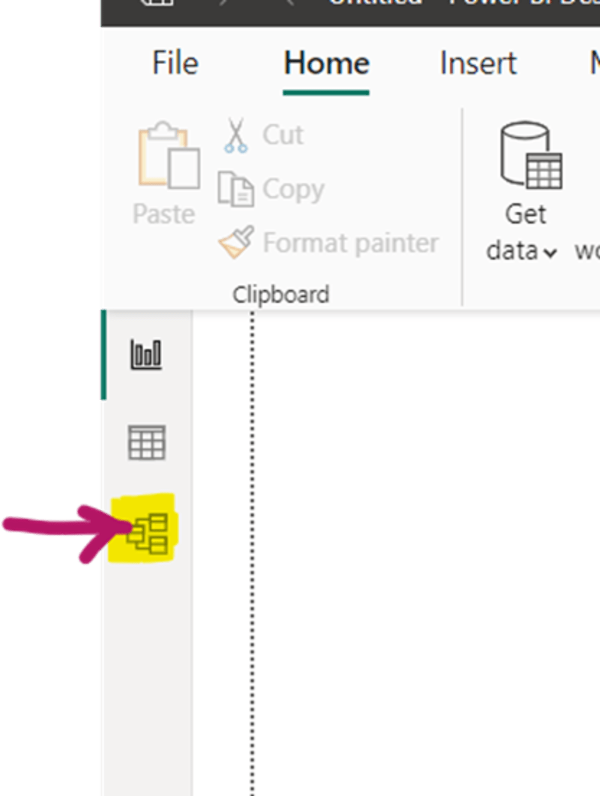
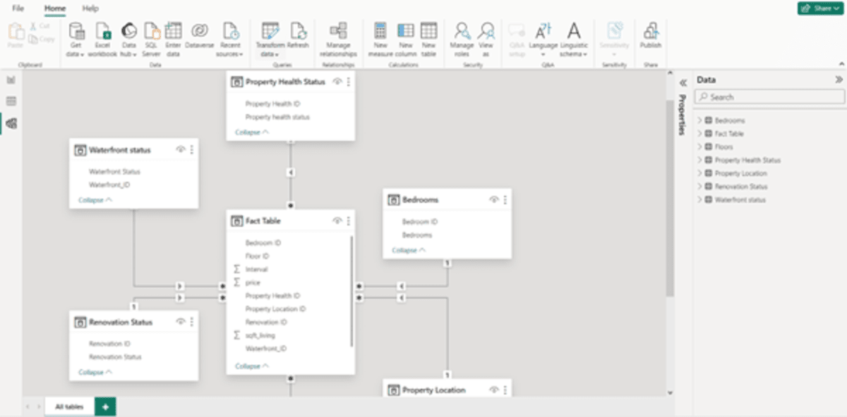
Before that, if you wish to see the model view of your data, click on the “Model View” on the left as shown in the screenshot below:
The model view will appear as follows:
Let’s gear up for building visualization.
Unleash the true potential of your business intelligence by optimizing data relationships, crafting robust measures, and creating dynamic visuals.
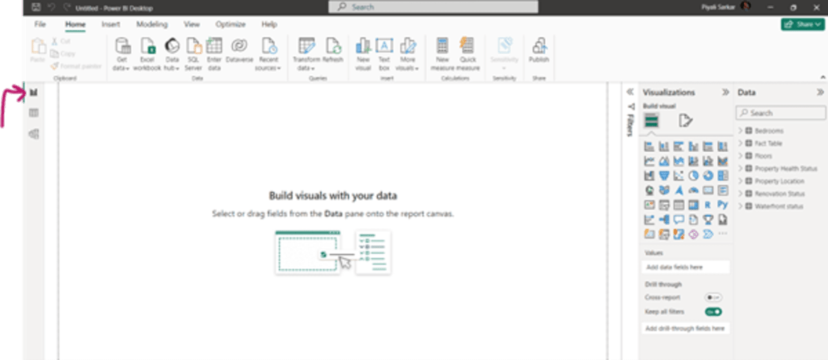
Get back to the “Report View.”
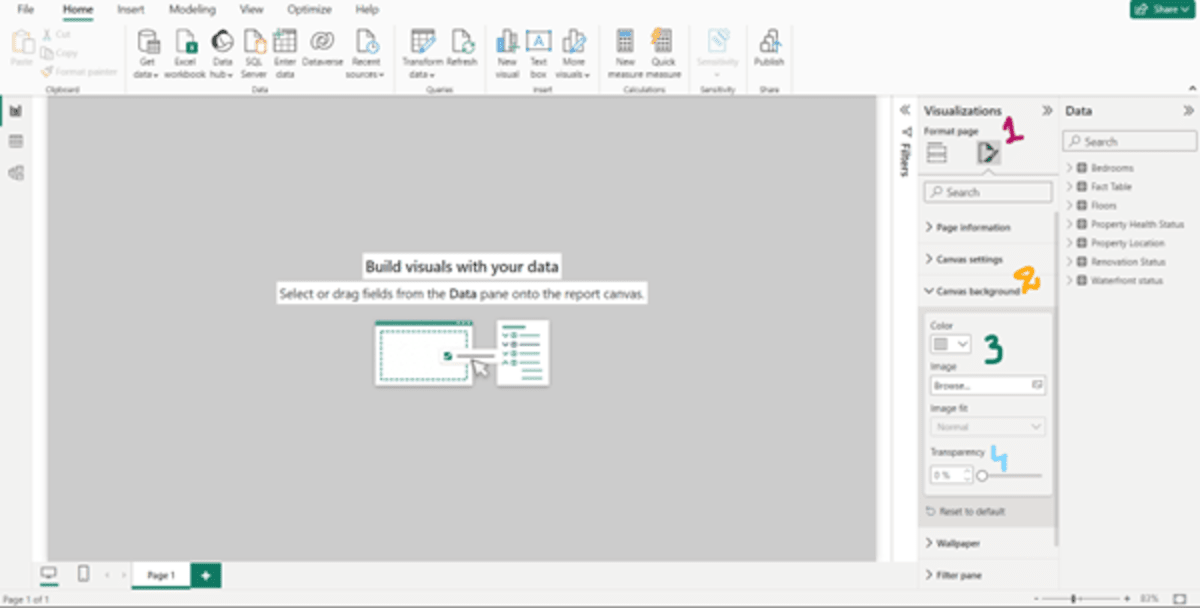
Now, suppose, we would like to have a background other than white.
To change the background color:
- Click on “Format Page” icon.
- Click on “Canvas Background.”
- Choose Color from the drop-down menu.
- Set Transparency at 0%.
- Check the pane is reflected with the chosen color.
Note: The image below has the step numbers written on the screen.
Now, to create clear visualizations, first, let us start with creating a template.
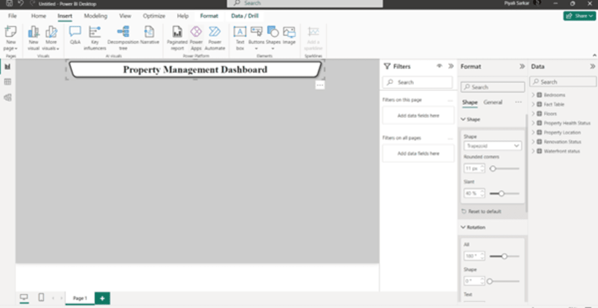
Let’s insert the title of the dashboard.
To do that,
- Select “Insert” from the ribbon.
- Go to “Shapes” and select a shape of your choice. We have used a trapezoid.
- Go to “Format” whether you want to change the shape’s color, rotate it, add borders, or shadow. In our example, we have changed the color, rotated the trapezoid at 180 degrees, added borders and changed the border color, added a shadow effect, and rounded the corners. We have added text, rotated it, and changed the font, color, and size.
We will add a couple of more boxes and format them with the same process as per our need to visualize the data. So, we’ve created two dashboards for Overview and Property Location.
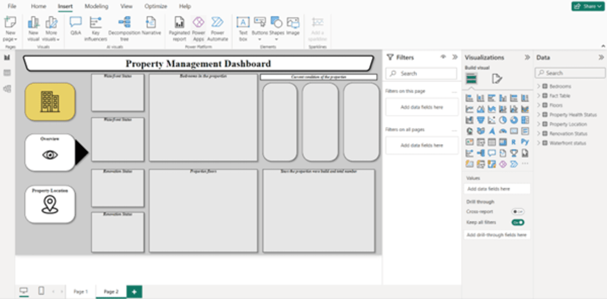
Overview Dashboard
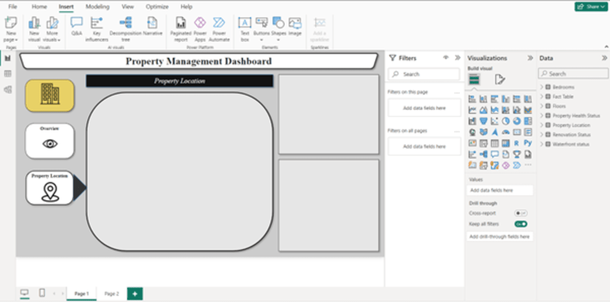
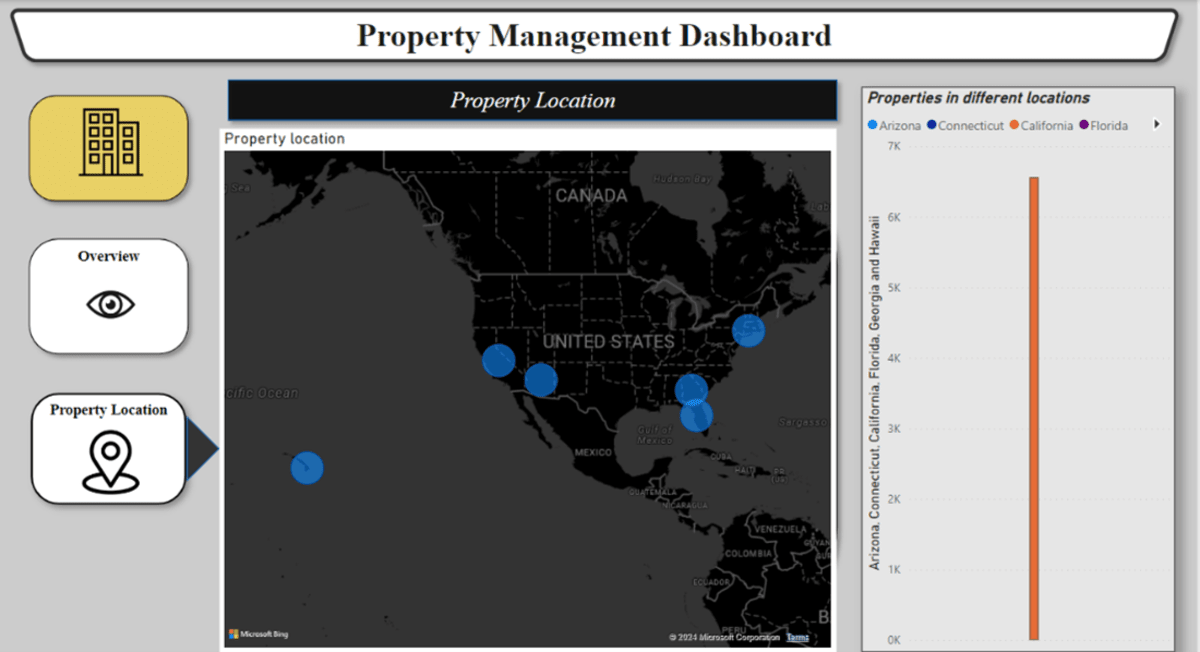
Property Location Dashboard
Now, let’s start with the Overview Dashboard.
We have a table for Waterfront Status that gives us whether the property has a Waterfront or not. But we don’t have a count of the total properties that have a waterfront. So, to calculate and visualize on the dashboard:
- Go to Home –> New Measure
- Now, we need to calculate the total number of properties in the fact table. So, we will use the following syntax: Total Properties = COUNTROWS(‘Fact Table’), and press enter.
- Now calculate the total properties with the waterfront. For that, again click on “New Measure”
- 4. Enter the following syntax: With Waterfront = CALCULATE([Total Properties],‘Fact Table'[Waterfront_ID]=1) and press enter.
- Now create another measure without Waterfront = CALCULATE([Total Properties],‘Fact Table'[Waterfront_ID]=0) and press enter. All these tables will be created and you can find them in the data pane.
- Now, select the right visualization. As these will represent numbers, select card.
- Select the row you want the card to display. For example, we want to display first the properties with waterfront. So, check the checkbox with the waterfront measure created in the data pane. Your visualization is ready. Adjust the box and edit as per the visual requirements explained before this.
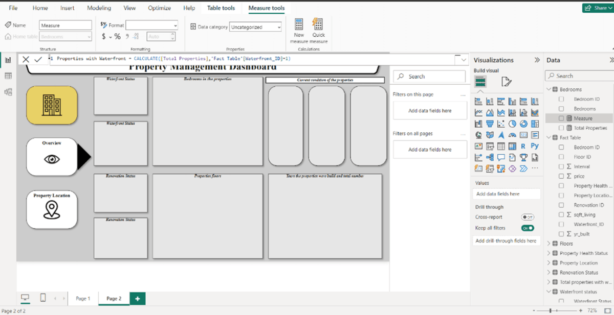
Image: Syntax while creating a new measure.
The screen below is the final output of this card.
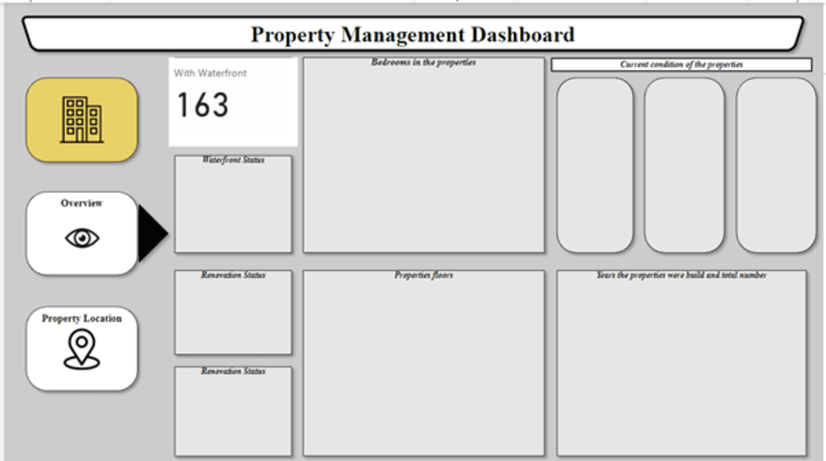
Image: Visualization for the total number of properties with waterfront.
Follow the same process for all the cards throughout the dashboard.
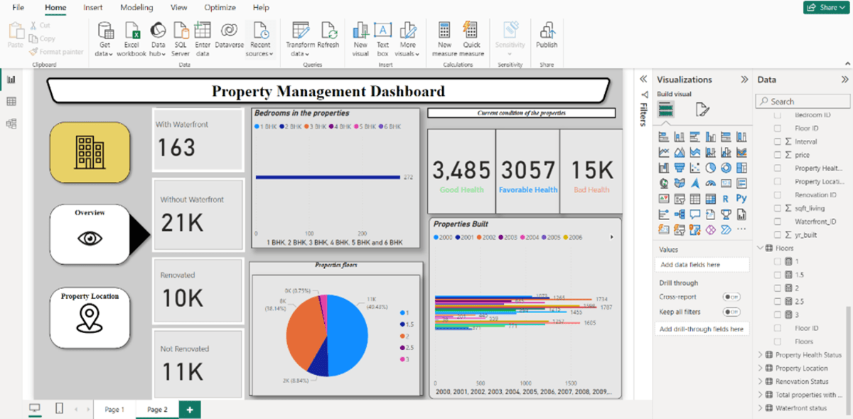
Similarly, your second dashboard will be created.
You can play around with the Power BI controls to edit the visualization as per your preferences and needs.
For example, you want to see only 6 BHK properties. To apply this filter, select the visual you want to apply the filter on –> Go to the Filter panel–>In the Add Data Fields, drag the filter you want to apply. Here we’ve dragged the “Bedrooms” data–> Check the box “Require single selection.”
To check if the filter was applied correctly, check the card for every selection.
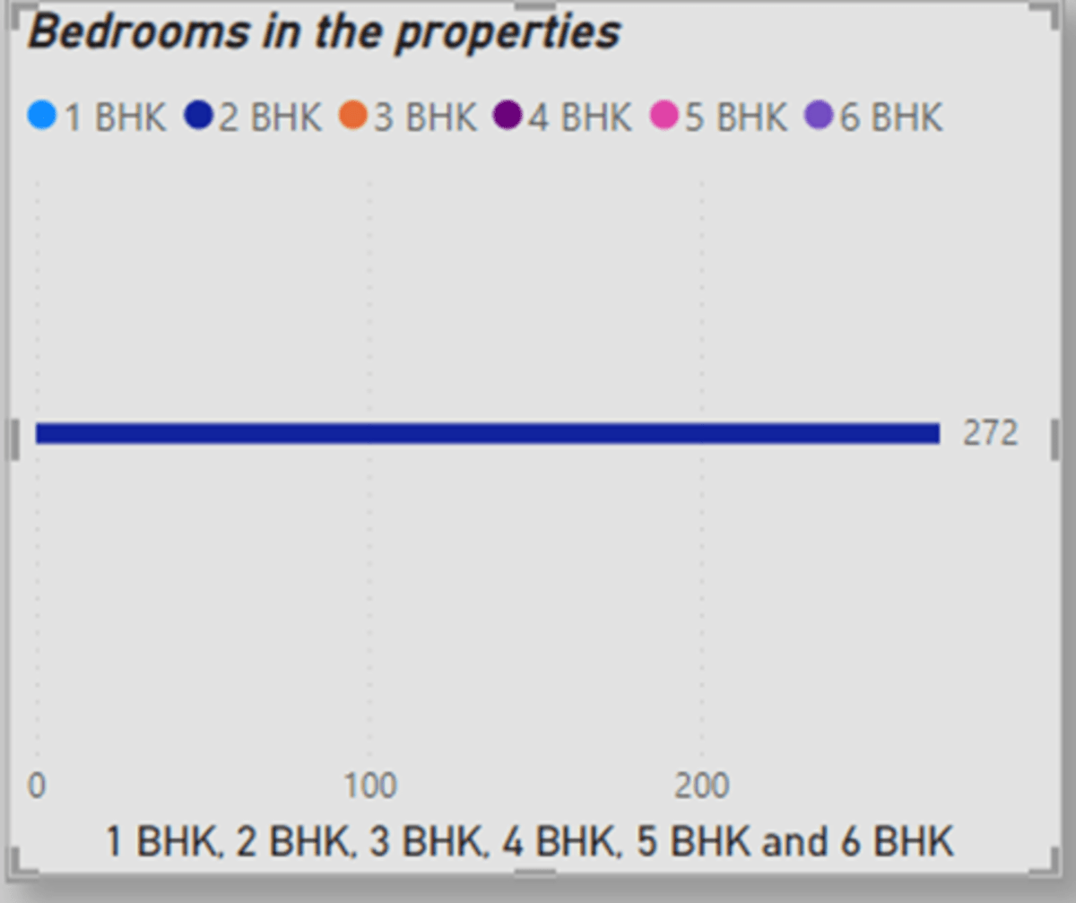
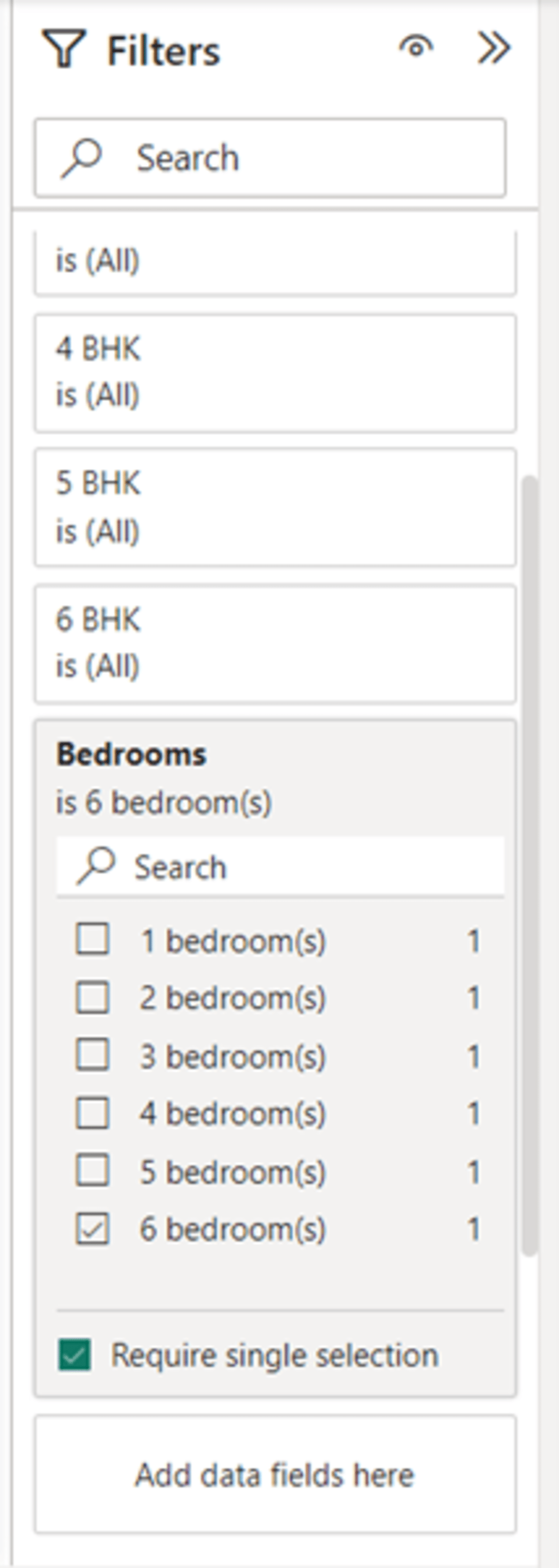
Image: Filter pane.
To connect both pages, click on “Overview” and go to “Actions.” Select Type “Page Navigation” and enter your destination page. For example, the overview dashboard is on page 2. So, the destination page on clicking overview will be Page 2.
To summarize, dashboards powered by Microsoft Power BI play a pivotal role in revolutionizing decision-making processes for real estate organizations. By consolidating and visualizing diverse datasets, these dashboards offer a comprehensive overview of property portfolios, market trends, and operational metrics. The interactive nature of Power BI visualizations facilitates quick insights, enabling executives to make informed decisions on property acquisitions, pricing strategies, and operational efficiency. From predicting market trends to monitoring financial performance and enhancing communication with stakeholders, Power BI dashboards empower real estate organizations to navigate the dynamic industry landscape with agility and strategic precision.
Crafting impactful dashboards isn’t an easy feat, but with the right set of technology partners, it becomes a seamless journey towards data-driven success. Elevate your real estate organization with our expertise in harnessing the full potential of Power BI. Let us be your strategic ally in transforming complex data into actionable insights. Explore the possibilities; contact us today for a collaborative journey towards unparalleled decision-making prowess in the realm of real estate.