Do you know that 55% of consumers are more likely to remember a story than a list of facts?
We are all familiar with Nike’s ‘Just Do It’ campaign. Once, Nike’s products catered exclusively to Marathon runners. But after the storm of the fitness craze, the Marketing Team at Nike knew the urgency to capitalize on this buzz. One of the main reasons was to surpass Reebok, their main competitor. True that! Reebok was selling more than Nike back then! Therefore, in the late 1980s, Nike introduced its ‘Just Do It’ campaign. And it was a massive hit and the most memorable one!
Just think for a moment. How do you resonate with ‘Just Do it’? A small tagline that encapsulates the feeling of every individual while doing physical training or hitting the gym. So, if you don’t want to run 5 miles, ‘Just Do It.’ Don’t want to squat 30X4 reps, ‘Just Do It.’ The result? Their sales exceeded $9.2 billion by 1998!
This example shows how storytelling is vital to connect with your audience. It not only helps to grab the eyeballs and interest of your audience but also increases the chances of delivering your message more effectively. And this gives you a distinct brand identity and a loyal customer base.
| Business storytelling is how you convey your message and connect with your audience strategically through stories |
So, tell a story and see how your brand differentiates from your competitors because:
- It makes information more engaging and relatable.
- It eases conveying ideas, strategies, and data-driven insights.
- It enhances engagement with better information retention.
- It taps into emotions, fostering a deeper connection with the audience.
- It helps businesses connect with their target audience personally, driving increased sales.
Now let us walk through Nike’s other campaign- ‘You Can’t Stop Us’ launched in July 2020.
Nike’s ‘You Can’t Stop Us’ Campaign
As quoted, “Success is about taking advantage of the opportunity,” Nike took it literally! How did they do it?
The lockdown was all about people adapting to the new normal. From e-training to virtual races, home workouts became a new way to stay fit sitting at home.
So, to capitalize on this new norm, they wanted to understand the number of people staying active, what sports they participated in, and how they used Nike’s products during lockdown.
They started with data collection, integration, and analysis from various sources like fitness apps, wearable devices, social media, and Nike’s own digital platforms.
But to extract insights from this massive amount of fitness data, they processed and visualized it with a data visualization tool. This visualization helped them to analyze customer demographics, behavior, and preferences during the lockdown.
The insights helped them identify the shift in consumer behavior as an opportunity.
Also, they could have noticed increased use of their fitness apps, website visits, and social media engagement related to home workouts.
All these insights helped them craft a campaign that aligns with the changing customer needs. Hence, the campaign ‘You Can’t Stop Us.’
The campaign focused on the shared global experience of resilience, unity, and overcoming challenges that resonated with people facing lockdowns and adversity.
So, Nike used a narrative in their campaign. It emphasized that challenges could not stop people from pursuing their goals, which was their brand message of ‘Just Do It’ with a broader message of resilience.
The ‘You Can’t Stop Us’ campaign is a perfect example of how a brand can leverage the power of data-driven insights to craft business storytelling to create a meaningful connection with its audience during a challenging time and reinforce the brand’s commitment to sports and fitness.
So, what is data-driven storytelling?
It is all about using data as the core element of crafting a story to enhance its impact and make it more relatable. Some examples of data-driven storytelling are:
- Business reports where companies use data-driven storytelling in annual reports, sales presentations, and market analysis. They combine data on financial performance, customer trends, and market conditions to convey their strategies and achievements.
- Journalism, where news organizations use data-driven storytelling to present investigative reports, visualized election results, and data-rich articles.
- Marketers use data-driven storytelling to create targeted ad campaigns, email marketing, and content marketing. They collect and analyze customer data to craft messages that resonate with specific demographics.
- Public policymakers use data-driven storytelling to advocate for specific policies or highlight social issues. They may use statistics and research findings to support their initiatives.
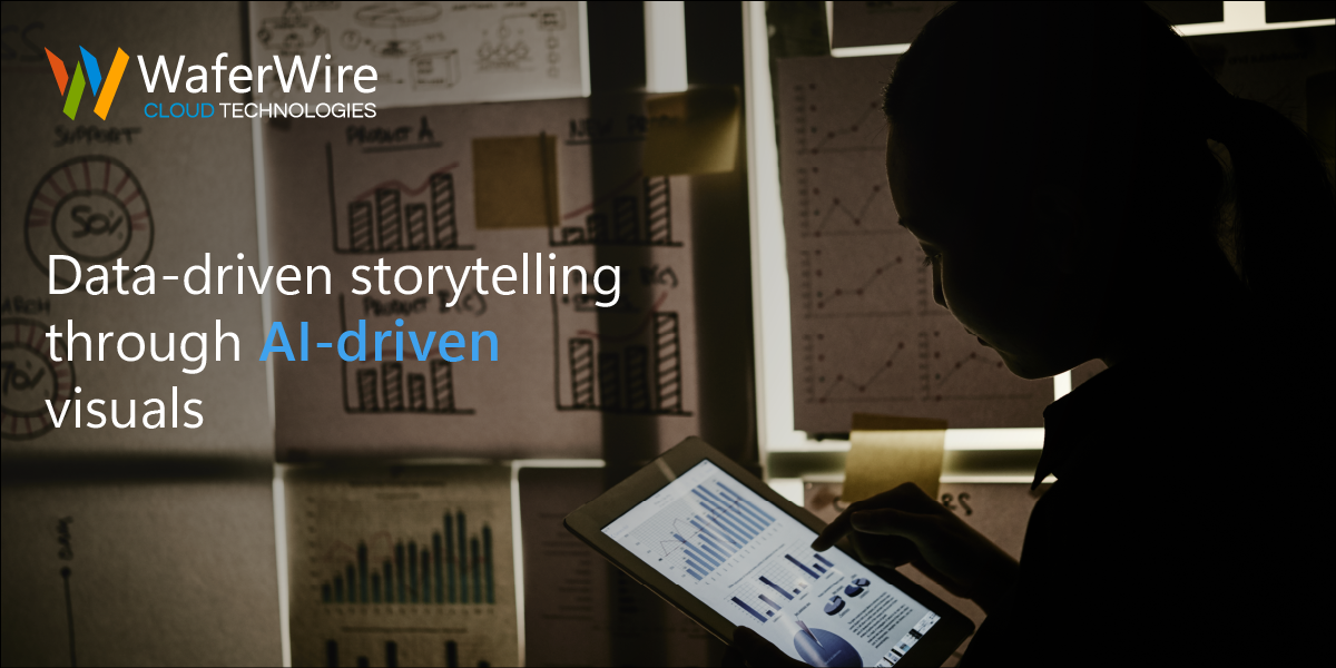
Role of AI-driven visuals in data storytelling
AI-driven visuals play a crucial role in data storytelling by making complex data more accessible, engaging, and understandable for a broader audience. They can automatically analyze and transform data into compelling visuals to enhance the story.
Here’s how AI-driven visuals contribute to data storytelling:
1. Data Simplification: AI algorithms can process large datasets and identify key trends, patterns, and insights. They simplify complex data by condensing it into easily digestible visuals, like charts, graphs, and infographics. This simplification helps the audience quickly grasp the main points.
For example, imagine a financial news outlet that wants to tell a story about the stock market’s performance over the past year. Instead of presenting a spreadsheet of raw stock prices and daily fluctuations, AI-driven visuals can create a line graph showing the market’s comprehensive upward trend with important events marked, making the data much cleaner.
2. Personalization: AI can tailor visuals to the preferences and needs of individual viewers. With user data analysis, AI can generate visuals that resonate with the audience’s interests, making the storytelling experience more engaging and relevant.
For example, a sports website wants to display statistics from a recent football game. AI can customize the visual presentation based on the user’s favorite team, highlighting their performance and key players.
3. Real-time Updates: AI-driven visuals can provide real-time updates to the audience. This is particularly valuable when telling stories about dynamic situations, such as live events or rapidly changing trends.
For example, during a global sporting event like the Olympics, AI can generate real-time medal count visuals that update as new results come in. It will keep the audience informed about the latest standings.
4. Interactivity: AI can create interactive visuals. These visuals allow users to explore the data on their own. Viewers can click, zoom, and interact with the visuals to deeply understand the data.
For example, a news website covering climate change might include an interactive map that allows users to explore temperature trends by region, zooming in to see local data and historical changes.
5. Predictive Analytics: AI can generate visuals that depict future trends based on historical data and predictive algorithms. These visuals help the audience understand potential future developments.
For example, a finance company may use AI to create a visual showing predicted stock market trends for the next quarter. This can guide investors in their decision-making.
6. Data Correlations: AI can identify correlations within data that might not be immediately apparent to the human eye. It can then generate visuals that highlight these relationships.
For example, in healthcare, AI-driven visuals might reveal a strong correlation between a specific lifestyle factor and a particular health condition. This visual insight can guide public health initiatives.
Steps to enhance your data-driven storytelling with AI-driven visuals
Enhancing data-driven storytelling with AI-driven visuals can significantly boost your business’s ability to communicate insights effectively. Here are the steps to achieve this:
- Define Your Objectives:
- Determine the primary goals of your data-driven storytelling efforts. What message or insights do you want to convey through AI-driven visuals?
- Gather Relevant Data:
- Collect and organize data from various sources. Ensure the data is accurate, up-to-date, and relevant to your objectives.
- Understand Your Audience:
- Identify your target audience and their preferences. What type of visuals and data will resonate with them? Tailor your approach accordingly.
- Select the Right AI Tools:
- Choose AI tools and platforms that are suitable for data visualization and storytelling. There are various options available, from data analytics software to specialized data visualization tools.
- Data Preprocessing:
- Clean, preprocess, and format the data to make it suitable for visualization. Ensure data quality and accuracy. For example, you can use Python code to remove duplicates or missing values-
| import pandas as pd
# Load your data # Remove duplicates # Handle missing values |
- Choose the Right Visualizations:
- Select appropriate visual formats (e.g., charts, graphs, maps, infographics) based on the type of data and the story you want to tell. The choice of visuals should enhance understanding.
Have a data visualization tool in your mind, but unsure about its relevance to your business data?
- Create Custom Visuals:
- Use AI tools to create custom visuals. Many AI platforms offer features for automatically generating visuals, such as auto-charting and infographic creation. For example, to automatically generate visual elements using Python and Matplotlib:
| import matplotlib.pyplot as plt
# Create a line chart |
- Add Interactivity:
- Consider incorporating interactive elements into your visuals. This could include tooltips, drill-down features, or animations to engage your audience and allow them to explore data further.
- Ensure Consistency:
- Maintain consistency in design, colors, fonts, and branding across all visuals. Consistency makes your data-driven storytelling more professional and recognizable.
- Data Correlation and Insights:
- Leverage AI to identify data correlations and insights within your dataset. Use these insights to guide the storytelling process.
- Real-time Updates:
- If relevant, set up visuals to provide real-time updates. This is particularly useful for reporting on dynamic or rapidly changing situations. For example, For dynamic data, implement automatic updates using Python to fetch real-time data from your source and refresh the visual:
| import time
while True: |
- Test and Optimize:
- Test your visuals with a sample audience to gather feedback. Use this feedback to optimize your visuals for clarity and impact.
- Narrate the Story:
- Your visuals should be part of a larger narrative. Craft a compelling storyline that guides the audience through the data and insights. Explain the significance of what they’re seeing.
- Mobile Optimization:
- Ensure that your visuals are mobile-friendly. Many people access data on smartphones, so your visuals must be responsive and easy to view on small screens.
- Data Security:
- Pay attention to data security. Ensure that sensitive or confidential data is protected, especially if you are using cloud-based AI tools.
- Compliance and Privacy:
- Comply with relevant data protection regulations and privacy laws when dealing with customer data or personally identifiable information.
- Training:
- Train your team to work with AI-driven visuals and data storytelling tools. Ensure they can interpret and effectively communicate insights from the visuals.
- Continuous Learning:
- Stay updated with the latest developments in AI-driven visuals and data storytelling. The field is rapidly evolving, and ongoing learning is essential.
- Feedback Loop:
- Establish a feedback loop with your audience. Listen to their comments and suggestions and use them to refine your data-driven storytelling approach.
- Measure Impact:
- Use analytics to track the impact of your data-driven storytelling efforts. Monitor engagement, shares, conversions, and other relevant KPIs to assess the effectiveness of your visuals.
In summary, data-driven storytelling is a powerful tool that resonates with your audience, delivers messages effectively, and builds a distinct brand identity. Nike’s ‘You Can’t Stop Us’ campaign is a prime example of leveraging data-driven insights to connect with the audience and reinforce brand commitment during challenging times. Using AI-driven visuals simplifies complex data, personalizes content, provides real-time updates, adds interactivity, predicts future trends, identifies data correlations, and ultimately enhances data storytelling. By following the steps outlined, you can harness the full potential of AI-driven visuals to enhance your data-driven storytelling efforts and communicate insights effectively to your audience, while also staying compliant and maintaining data security.