
With Power BI in 2014, expectations that a BI tool can gain insights into structured and unstructured data were finally met. But from users starting mulling over various bugs, complicated interfaces and complex dashboards to remarkable visualizations, advanced filtering and formatting capabilities, Power BI helps the users make insightful and well-thought business decisions.
Driving incredible data experiences
With data generation at an unprecedented rate by IoT sensors, system telemetry and human interactions, organizations need to gather them, store and then extract intelligence, to outperform the rest.
With Microsoft giving updates every month, Power BI has either revamped or new features – they might include improved reporting capabilities, making it easier to oversee compelling content.
Power BI can meet the most demanding needs of large enterprise customers – the decision to choose to standardize on Power BI, will be fruitful.
Power BI visuals
These are attractive charts and graphics that one can use to revitalize data. To connect, interact and appeal the audience, visuals remain key because they boost comprehension and increase retention.
That allows them to view data insights more effectively and as a result, make informed decisions quickly. It becomes useful especially when tabular report formats need to be transformed with a more visual approach, so that it can be presented to the management and the stakeholders. Further aligning and matching organization’s branding and presentation goals.
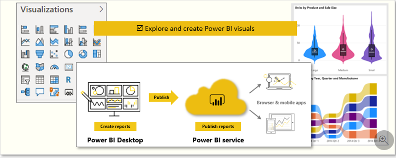
In Power BI Desktop, each visual is represented by an icon in the Visualizations pane. The types of visuals that are available include charts, maps, cards, a table, a matrix, and many more.
In the below example, if one wishes to add a visualization to the report that displays sales data by category name, one can start by selecting the CategoryName and SalesAmount fields in the Fields pane. Power BI Desktop then automatically selects a visualization, depending on the data type of the fields selected. In this case, the default visualization type is a table.
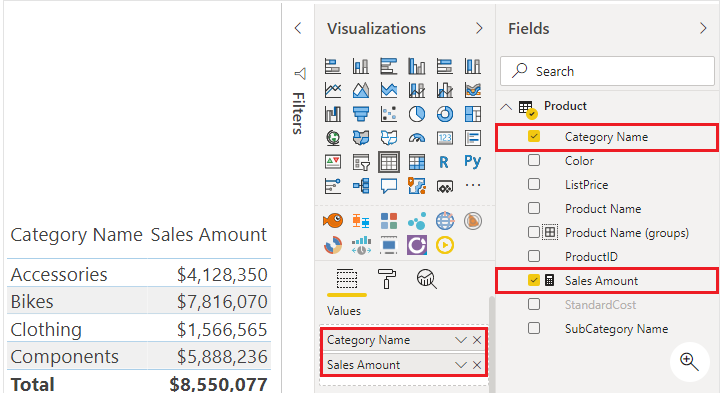
The visualization type can be changed by selecting a different visual from the Visualizations pane.
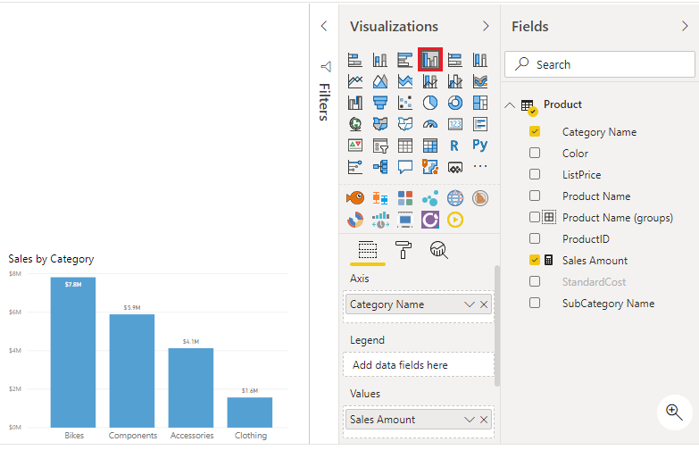
In such way, Power BI Desktop offers a range of out-of-the-box visualization options available directly from the Visualizations pane. When one chooses the fields to display in a visualization, one can experiment with all the different visualization types to find the one that best suits the company needs.
It is important to choose an effective visualization to ensure the display of data in the best way possible.
For customers who are need to adapt quickly to the altering business needs and need to move from insights to action to automation, Power BI is useful. For organizations, it helps create a global, scalable, secure, and integrated BI platform that effectively accommodates the needs of both self-service and centralized tools.
A company can benefit from an updated, compliant platform as the sole destination for insightful analytics, with primary enterprise-facing updates that depend on industry-based models and data management on a larger scale.
Plus, when it comes to collaboration with organizations, Power BI makes it easier as it integrates deeply with Office 365, Microsoft Teams, Excel, PowerPoint, and more.
We, WaferWire Cloud Technologies helps businesses unleash the power of Power BI through our quality Power BI Consulting Services. Our Power BI experts can help you enhance your business productivity and efficiency with easy to use and highly functional dashboards and reports specific to your business needs. To know more, contact us today.