


Thank you! Your submission has been received!
Oops! Something went wrong while submitting the form.


Imagine you are a manager at a retail store, and you have a spreadsheet with sales data for the past year. The data includes columns for the date, product category, sales quantity, and revenue generated. Here's what the raw data might look like: DateProduct CategorySales QuantityRevenue01-01-2022Electronics50$5,00002-01-2022Clothing30$1,50003-01-2022Electronics60$6,00030-01-2022Clothing55$2,75031-12-2022Clothing40$2,00010-04-2022Clothing60$3,00011-04-2022Electronics140$14,00012-04-2022Books85$4,25013-04-2022Electronics145$14,50014-04-2022Clothing65$3,20015-04-2022Electronics150$15,00016-04-2022Books90$4,50017-04-2022Electronics155$15,50018-04-2022Clothing70$3,50019-04-2022Electronics160$16,00020-04-2022Books95$4,75021-04-2022Electronics165$16,50022-04-2022Clothing75$3,75023-04-2022Electronics170$17,00024-04-2022Books100$5,000Fig. Sample Sales Data While this raw data provides valuable information, it can be challenging to quickly gain insights or spot trends by simply looking at numbers in a spreadsheet. This is where data visualization becomes crucial. For example, Suppose you want to analyze the trend in sales quantity and revenue for Electronics products over the year. Creating a line chart can help you see how these metrics change over time. Here's a simplified representation:
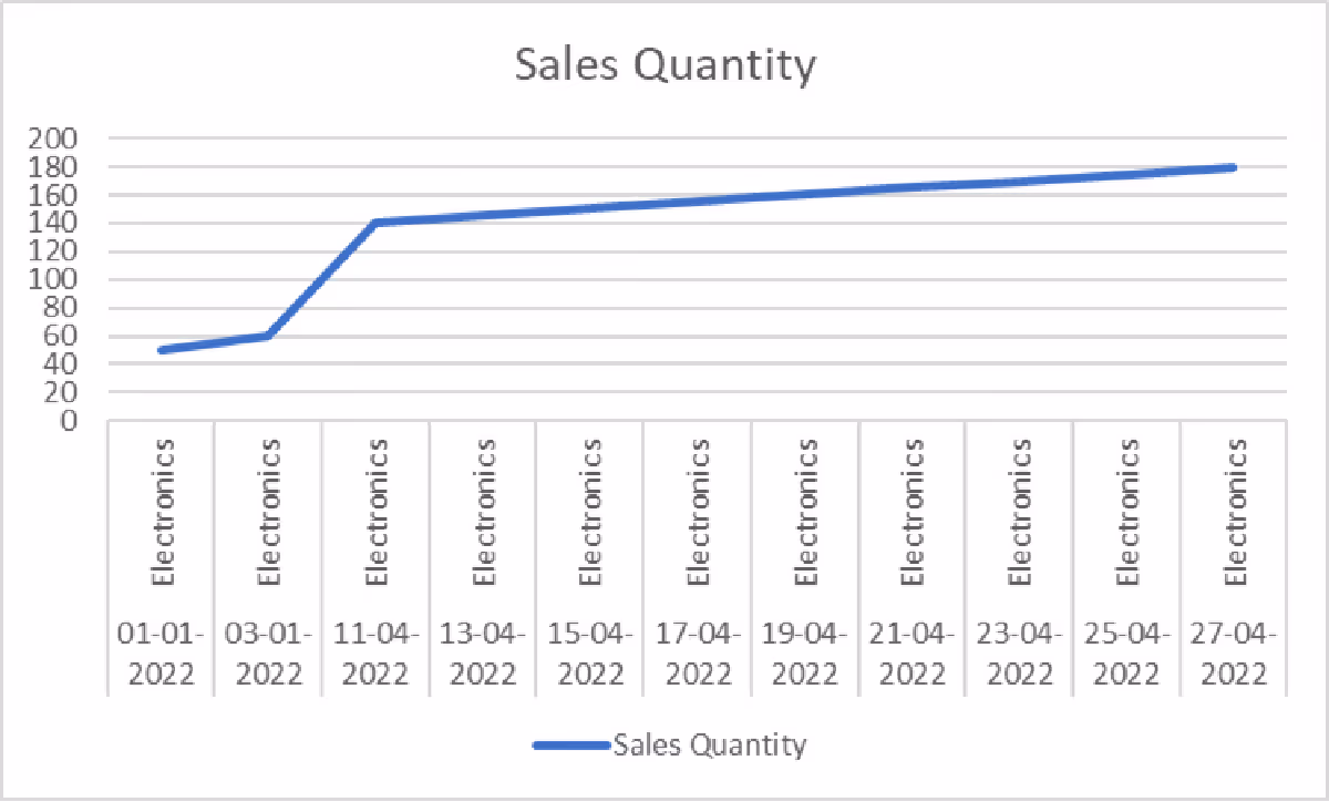
Fig. Sales Quantity for last year

Fig. Revenue data for last year Suppose you want to compare the performance of different product categories and check which of them was most profitable.
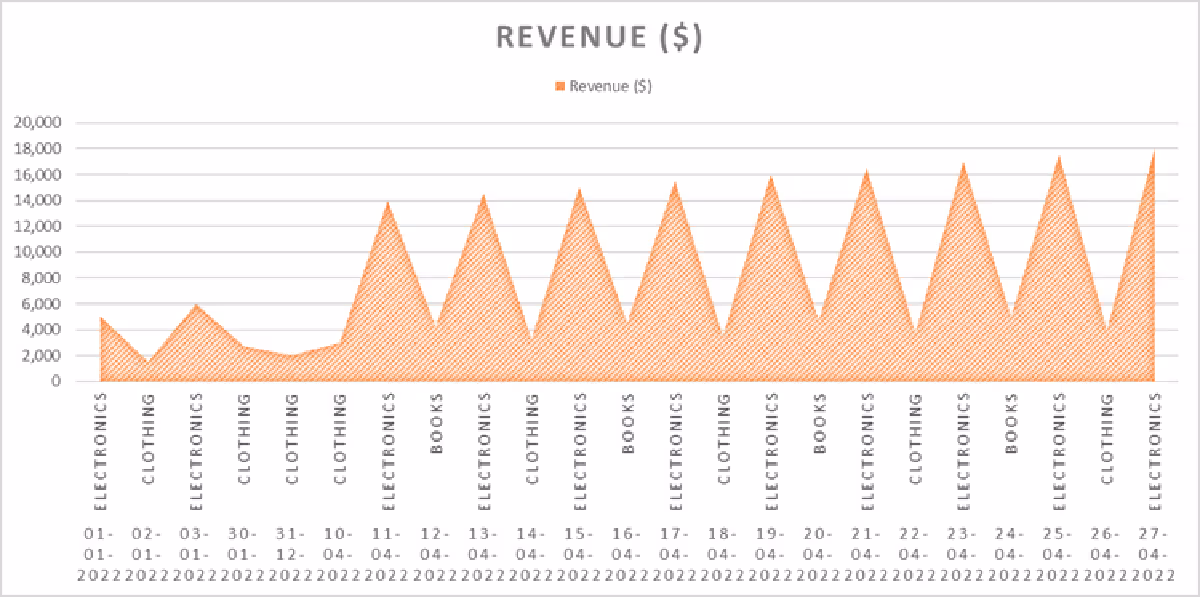
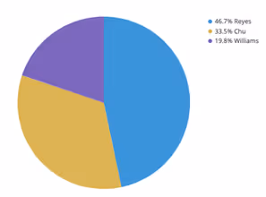
Fig. Product performance according to revenue earned from each product These visualizations make it easy to:
So, what is data visualization? Data visualization is the graphical representation of data to help people understand the information it contains. It involves using visual elements such as charts, graphs, maps, and other graphical formats to display complex data sets in an easily understandable and visually appealing manner. The primary goal of data visualization is to make data more accessible, interpretable, and actionable. With data visualization, you get benefits such as:
Do you want to know more about how you can drill down into your data for in-depth analysis?
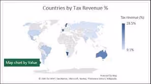
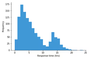
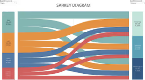
Some common types of data visualization are: Data visualization typesPictorial representation


Now, let us see how to create data visualization with AI-powered tools like Power BI. Step 1: Install Power BI Desktop If you have not already, download and install Power BI Desktop from the official Microsoft website: https://powerbi.microsoft.com/en-us/desktop/

Fig: Power BI Desktop on installation Step 2: Import Your Data

Fig. Get data
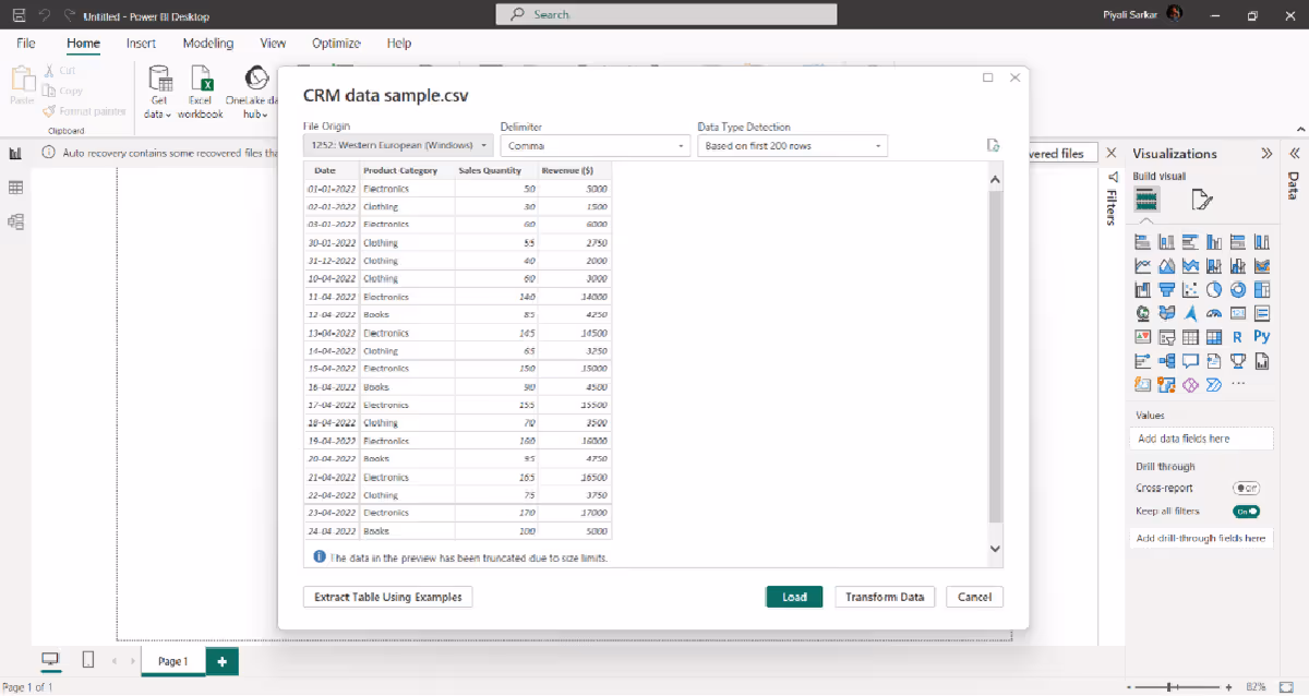
Fig. Connecting your database

Fig. Load the data After clicking load, you get the following screen:

Fig. After clicking on load. Step 3: Prepare Your Data (if needed)
Do you have a data set and want to prepare your data as per your requirements?
Step 4:Create a Data Model
Step 5: Create visualization In step 2, once you load and connect your data, you may see that some of your records have the summarization sign "∑". In our example, we have it for Revenue and Sales. It means the data is organized or structured to allow automatic aggregation or Summarization of certain values. This often occurs when working with databases or data tables that have predefined calculations or aggregations applied to specific fields or columns. Here's a more detailed explanation:
For example, if you have a sales database with individual sales transactions, you could create a "Total Revenue" field that automatically sums up the revenue for each transaction related to a specific product or time period. This way, when you query the data, you can easily retrieve the total revenue for each category or time frame without manually summing up the individual transaction amounts. Summarization by default can save time and simplify data analysis, especially when dealing with large datasets or when you need to produce summary reports or visualizations quickly. Now let’s create a visualization with the Summarization field. Go to the "Report" view in Power BI Desktop.

Fig. Report view From the "Visualizations" pane on the right side of the screen, select the type of visualization you want to create. For this example, let's create a bar chart to visualize the "Revenue" by "Product Category."

Fig. Visualization pane

Fig. Total Revenue for each product category This is a visualization in Power BI using aggregated revenue value. Step 5: Customize the Visualization (Optional)

Fig. Post formatting visuals Step 6: Interact with the Visualization (Optional)

Fig. Filters Suppose you want to check the sum of revenue in January 2022. You will get the following:

Fig. Viewing total revenue in the month of January Add a slicer: Click the ‘Slicer icon’ in the Visualizations panel

Fig. Slicer icon You will notice an empty slicer visual on your canvas. To populate it with content, direct your focus to the fields pane.

We have added another field of Sales rep to our sample data. We have dragged the sales rep and the total revenue categories to add a slicer. Step 7: Save and Publish (Optional)
Step 8: Repeat for Other Visualizations (Optional)
To summarize, data visualization is significant in making sense of complex data. It is a powerful medium to transform your data into actionable insights, enabling informed decision-making capabilities for you and your teammates. So, are you ready to unlock the potential of data visualization for your business?


Imagine you are a manager at a retail store, and you have a spreadsheet with sales data for the past year. The data includes columns for the date, product category, sales quantity, and revenue generated. Here's what the raw data might look like: DateProduct CategorySales QuantityRevenue01-01-2022Electronics50$5,00002-01-2022Clothing30$1,50003-01-2022Electronics60$6,00030-01-2022Clothing55$2,75031-12-2022Clothing40$2,00010-04-2022Clothing60$3,00011-04-2022Electronics140$14,00012-04-2022Books85$4,25013-04-2022Electronics145$14,50014-04-2022Clothing65$3,20015-04-2022Electronics150$15,00016-04-2022Books90$4,50017-04-2022Electronics155$15,50018-04-2022Clothing70$3,50019-04-2022Electronics160$16,00020-04-2022Books95$4,75021-04-2022Electronics165$16,50022-04-2022Clothing75$3,75023-04-2022Electronics170$17,00024-04-2022Books100$5,000Fig. Sample Sales Data While this raw data provides valuable information, it can be challenging to quickly gain insights or spot trends by simply looking at numbers in a spreadsheet. This is where data visualization becomes crucial. For example, Suppose you want to analyze the trend in sales quantity and revenue for Electronics products over the year. Creating a line chart can help you see how these metrics change over time. Here's a simplified representation:
Fig. Sales Quantity for last year
Fig. Revenue data for last year Suppose you want to compare the performance of different product categories and check which of them was most profitable.
Fig. Product performance according to revenue earned from each product These visualizations make it easy to:
So, what is data visualization? Data visualization is the graphical representation of data to help people understand the information it contains. It involves using visual elements such as charts, graphs, maps, and other graphical formats to display complex data sets in an easily understandable and visually appealing manner. The primary goal of data visualization is to make data more accessible, interpretable, and actionable. With data visualization, you get benefits such as:
Do you want to know more about how you can drill down into your data for in-depth analysis?
Some common types of data visualization are: Data visualization typesPictorial representation
Now, let us see how to create data visualization with AI-powered tools like Power BI. Step 1: Install Power BI Desktop If you have not already, download and install Power BI Desktop from the official Microsoft website: https://powerbi.microsoft.com/en-us/desktop/
Fig: Power BI Desktop on installation Step 2: Import Your Data
Fig. Get data
Fig. Connecting your database
Fig. Load the data After clicking load, you get the following screen:
Fig. After clicking on load. Step 3: Prepare Your Data (if needed)
Do you have a data set and want to prepare your data as per your requirements?
Step 4:Create a Data Model
Step 5: Create visualization In step 2, once you load and connect your data, you may see that some of your records have the summarization sign "∑". In our example, we have it for Revenue and Sales. It means the data is organized or structured to allow automatic aggregation or Summarization of certain values. This often occurs when working with databases or data tables that have predefined calculations or aggregations applied to specific fields or columns. Here's a more detailed explanation:
For example, if you have a sales database with individual sales transactions, you could create a "Total Revenue" field that automatically sums up the revenue for each transaction related to a specific product or time period. This way, when you query the data, you can easily retrieve the total revenue for each category or time frame without manually summing up the individual transaction amounts. Summarization by default can save time and simplify data analysis, especially when dealing with large datasets or when you need to produce summary reports or visualizations quickly. Now let’s create a visualization with the Summarization field. Go to the "Report" view in Power BI Desktop.
Fig. Report view From the "Visualizations" pane on the right side of the screen, select the type of visualization you want to create. For this example, let's create a bar chart to visualize the "Revenue" by "Product Category."
Fig. Visualization pane
Fig. Total Revenue for each product category This is a visualization in Power BI using aggregated revenue value. Step 5: Customize the Visualization (Optional)
Fig. Post formatting visuals Step 6: Interact with the Visualization (Optional)
Fig. Filters Suppose you want to check the sum of revenue in January 2022. You will get the following:
Fig. Viewing total revenue in the month of January Add a slicer: Click the ‘Slicer icon’ in the Visualizations panel
Fig. Slicer icon You will notice an empty slicer visual on your canvas. To populate it with content, direct your focus to the fields pane.
We have added another field of Sales rep to our sample data. We have dragged the sales rep and the total revenue categories to add a slicer. Step 7: Save and Publish (Optional)
Step 8: Repeat for Other Visualizations (Optional)
To summarize, data visualization is significant in making sense of complex data. It is a powerful medium to transform your data into actionable insights, enabling informed decision-making capabilities for you and your teammates. So, are you ready to unlock the potential of data visualization for your business?


.svg)
