
Imagine you are a manager at a retail store, and you have a spreadsheet with sales data for the past year. The data includes columns for the date, product category, sales quantity, and revenue generated. Here’s what the raw data might look like:
| Date | Product Category | Sales Quantity | Revenue |
|---|---|---|---|
| 01-01-2022 | Electronics | 50 | $5,000 |
| 02-01-2022 | Clothing | 30 | $1,500 |
| 03-01-2022 | Electronics | 60 | $6,000 |
| 30-01-2022 | Clothing | 55 | $2,750 |
| 31-12-2022 | Clothing | 40 | $2,000 |
| 10-04-2022 | Clothing | 60 | $3,000 |
| 11-04-2022 | Electronics | 140 | $14,000 |
| 12-04-2022 | Books | 85 | $4,250 |
| 13-04-2022 | Electronics | 145 | $14,500 |
| 14-04-2022 | Clothing | 65 | $3,200 |
| 15-04-2022 | Electronics | 150 | $15,000 |
| 16-04-2022 | Books | 90 | $4,500 |
| 17-04-2022 | Electronics | 155 | $15,500 |
| 18-04-2022 | Clothing | 70 | $3,500 |
| 19-04-2022 | Electronics | 160 | $16,000 |
| 20-04-2022 | Books | 95 | $4,750 |
| 21-04-2022 | Electronics | 165 | $16,500 |
| 22-04-2022 | Clothing | 75 | $3,750 |
| 23-04-2022 | Electronics | 170 | $17,000 |
| 24-04-2022 | Books | 100 | $5,000 |
Fig. Sample Sales Data
While this raw data provides valuable information, it can be challenging to quickly gain insights or spot trends by simply looking at numbers in a spreadsheet. This is where data visualization becomes crucial.
For example,
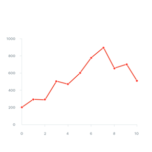
Suppose you want to analyze the trend in sales quantity and revenue for Electronics products over the year. Creating a line chart can help you see how these metrics change over time. Here’s a simplified representation:
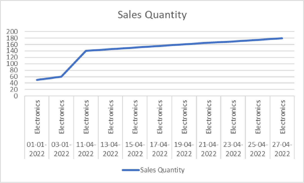
Fig. Sales Quantity for last year
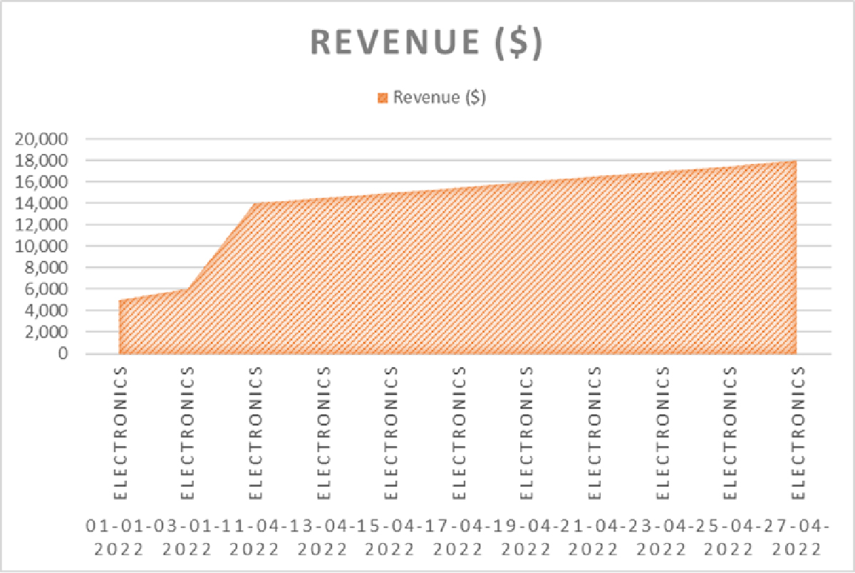
Fig. Revenue data for last year
Suppose you want to compare the performance of different product categories and check which of them was most profitable.
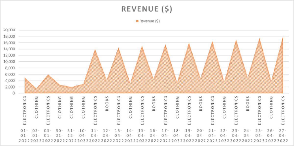
Fig. Product performance according to revenue earned from each product
These visualizations make it easy to:
- Identify sales trends over time for specific product categories.
- Compare the performance of different product categories.
- Make data-driven decisions, such as allocating resources to the most profitable product categories or adjusting marketing strategies.
So, what is data visualization?
Data visualization is the graphical representation of data to help people understand the information it contains. It involves using visual elements such as charts, graphs, maps, and other graphical formats to display complex data sets in an easily understandable and visually appealing manner. The primary goal of data visualization is to make data more accessible, interpretable, and actionable.
With data visualization, you get benefits such as:
- Clarity and understanding: With data visualization, you can easily grasp patterns, trends, and relationships within the data as it simplifies complex data by presenting it in a visual format.
- Insight discovery: By presenting data visually, patterns and insights that may not be apparent in raw data tables become more visible. This can lead to better decision-making and problem-solving.
- Communication: You can communicate data-driven insights to a wide audience, including non-technical stakeholders with data visualization as it helps to tell a story and convey information more effectively than raw numbers.
- Exploration: Get a deeper understanding of the data by drilling down into specific details or filtering data as needed with interactive data visualizations.
- Comparisons: Visualizations make it easy to compare different data points, variables, or categories, facilitating quick and informed comparisons.
- Identifying outliers: Visualizations can highlight outliers or anomalies in data, making it easier to identify potential errors or areas requiring further investigation.
- Forecasting: Certain types of visualizations, like time series charts, can help in forecasting future trends based on historical data.
Do you want to know more about how you can drill down into your data for in-depth analysis?
Some common types of data visualization are:
| Data visualization types | Pictorial representation |
|---|---|
|
 |
|
 |
|
 |
|
 |
|
 |
|
 |
|
 |
|
 |
|
 |
Now, let us see how to create data visualization with AI-powered tools like Power BI.
Step 1: Install Power BI Desktop
If you have not already, download and install Power BI Desktop from the official Microsoft website: https://powerbi.microsoft.com/en-us/desktop/
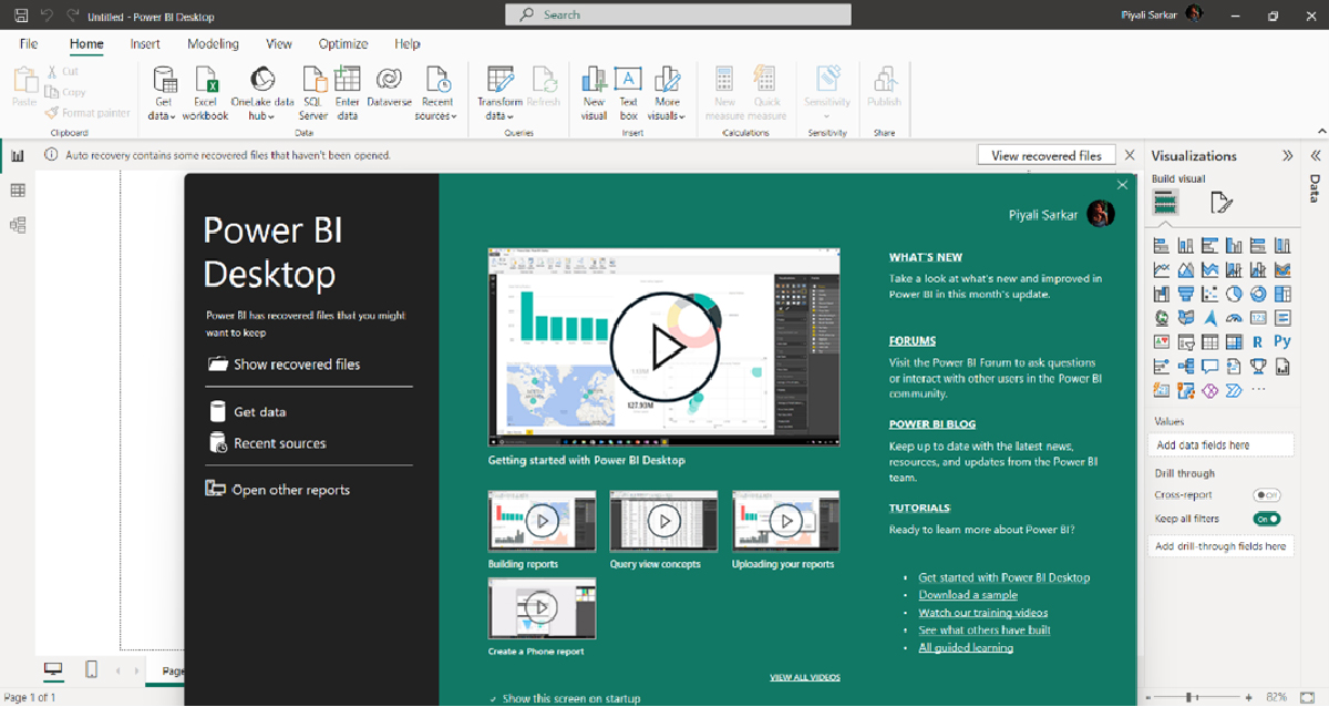
Fig: Power BI Desktop on installation
Step 2: Import Your Data
- Launch Power BI Desktop.
- Click on “Get Data” from the Home tab.
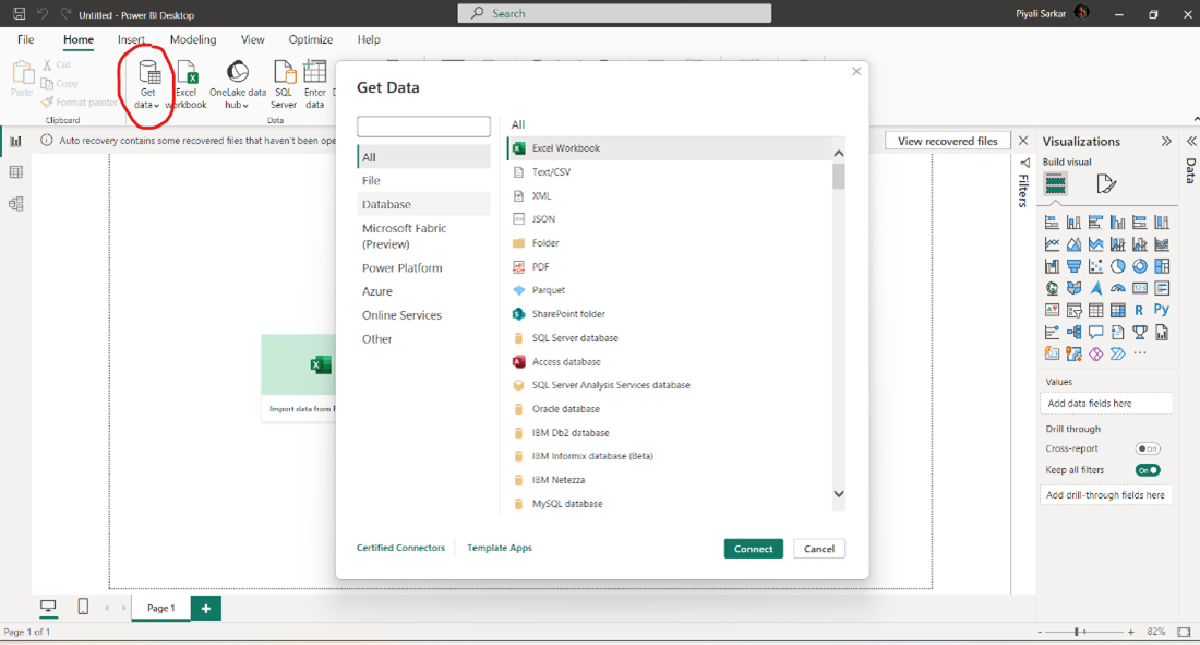
Fig. Get data
- Select the data source you want to import (e.g., Excel, CSV, SQL Server, etc.). Here in our example, the file is CSV. So, we will select Text/CSV from the list and click ‘Connect.’ We will get the following screen.
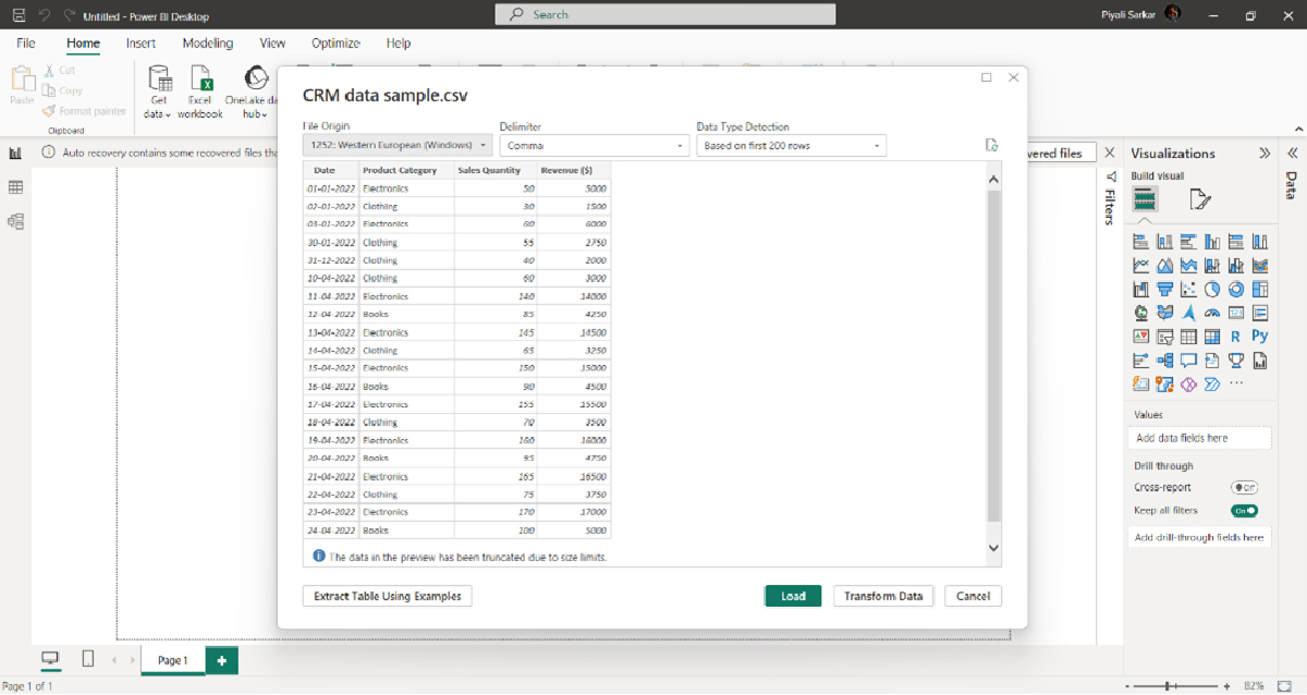
Fig. Connecting your database
- Choose the specific file or database table you want to import and click “Load” or “Transform Data” (depending on your preference). In our example, we will choose ‘Load.’
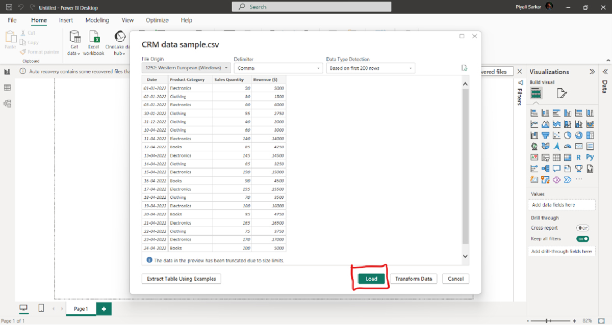
Fig. Load the data
After clicking load, you get the following screen:
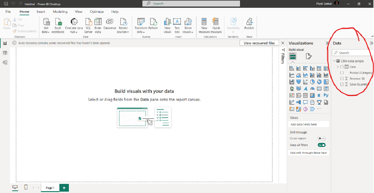
Fig. After clicking on load.
Step 3: Prepare Your Data (if needed)
- In the Power Query Editor, you can clean, transform, and shape your data as required. This may involve removing duplicates, filtering rows, merging tables, or performing calculations. This can be done when you want to transform your data.
Do you have a data set and want to prepare your data as per your requirements?
Step 4: Create a Data Model
- After loading and transforming your data, you will typically work in Power BI’s Data View. Here, you can define relationships between tables if your data consists of multiple tables. Currently, in our example, we have a single table.
Step 5: Create visualization
In step 2, once you load and connect your data, you may see that some of your records have the summarization sign “∑”. In our example, we have it for Revenue and Sales. It means the data is organized or structured to allow automatic aggregation or Summarization of certain values. This often occurs when working with databases or data tables that have predefined calculations or aggregations applied to specific fields or columns.
Here’s a more detailed explanation:
- Aggregated or Summary Records: Some databases or data tables include records that are already aggregated or summarized versions of the raw data. For example, instead of having individual sales transactions, you might have a record that represents the total sales revenue for a particular product category over a specific time period.
- Predefined Calculations: These aggregations are often the result of predefined calculations or functions applied to the raw data during the data preparation or data modeling process. Common aggregations include summing values, calculating averages, finding maximum or minimum values, and so on.
- Convenience: Summarization by default is convenient for reporting and analysis because it allows users to quickly access summary information without having to manually perform calculations each time, they need aggregated data.
For example, if you have a sales database with individual sales transactions, you could create a “Total Revenue” field that automatically sums up the revenue for each transaction related to a specific product or time period. This way, when you query the data, you can easily retrieve the total revenue for each category or time frame without manually summing up the individual transaction amounts.
Summarization by default can save time and simplify data analysis, especially when dealing with large datasets or when you need to produce summary reports or visualizations quickly.
Now let’s create a visualization with the Summarization field.
Go to the “Report” view in Power BI Desktop.
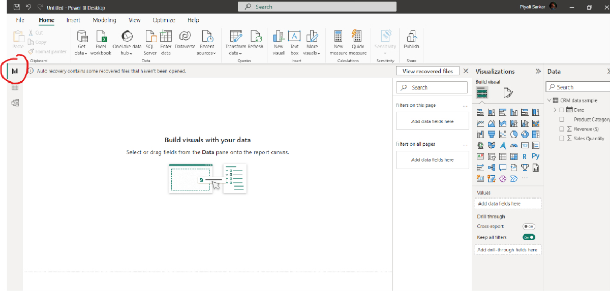
Fig. Report view
From the “Visualizations” pane on the right side of the screen, select the type of visualization you want to create. For this example, let’s create a bar chart to visualize the “Revenue” by “Product Category.”
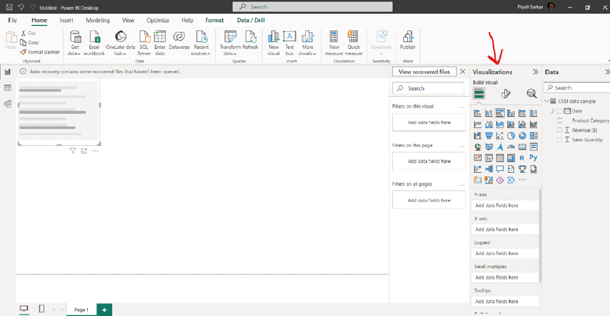
Fig. Visualization pane
- Add fields to the visualization. Drag and drop the “Product Category” field into the “Y-Axis”.
- Drag and drop the “Revenue” field into the “X-axis” field.
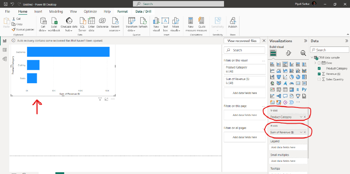
Fig. Total Revenue for each product category
This is a visualization in Power BI using aggregated revenue value.
Step 5: Customize the Visualization (Optional)
- Customize your bar chart as needed. You can adjust the chart title, data labels, colors, and other formatting options from the “Format” and “Visualizations” panes.
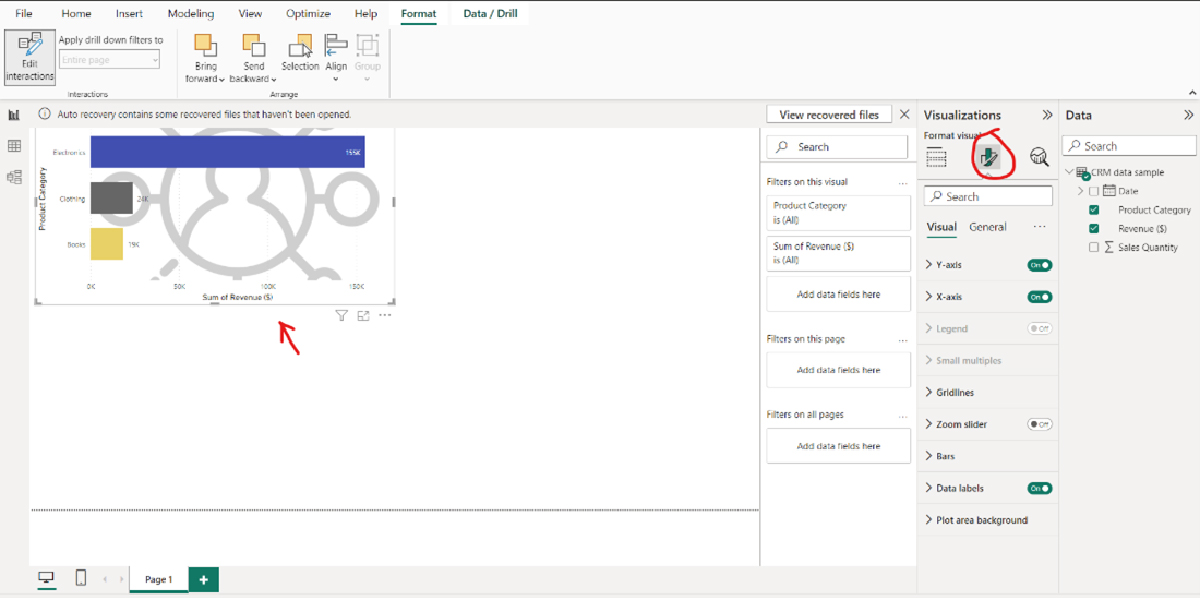
Fig. Post formatting visuals
Step 6: Interact with the Visualization (Optional)
- If you want to add interactivity to your visualization, you can use slicers, filters, or drill-through features. For example, you can add a slicer to filter data by date, allowing users to view revenue and sales quantity for a specific time frame.
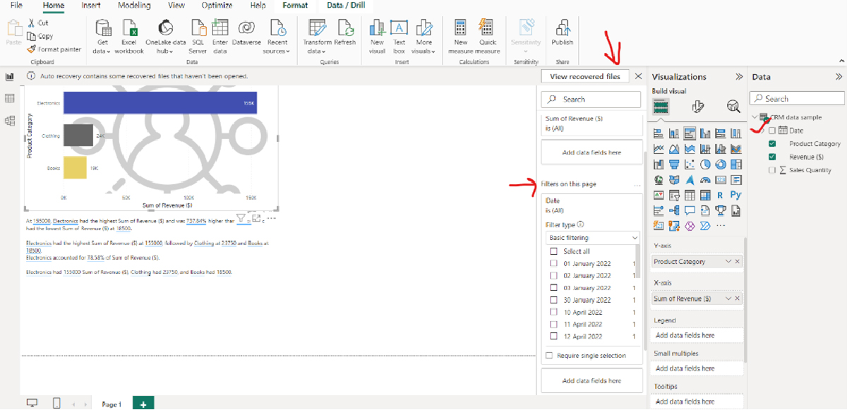
Fig. Filters
Suppose you want to check the sum of revenue in January 2022. You will get the following:
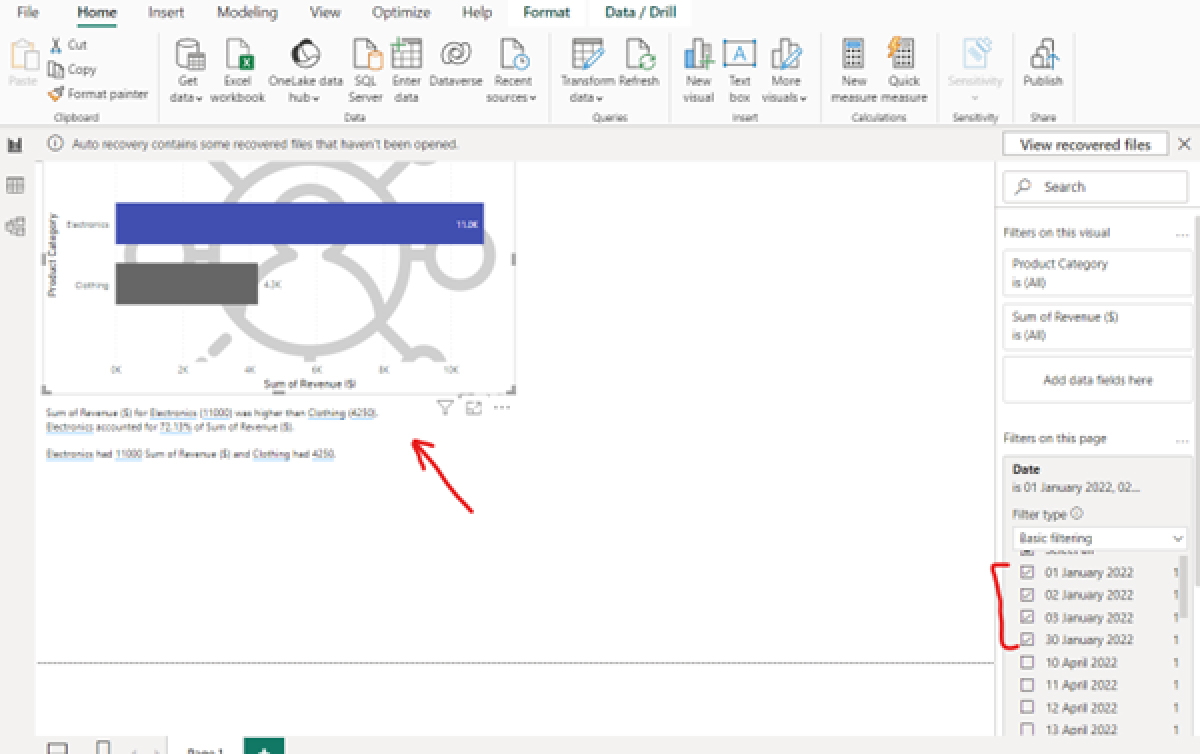
Fig. Viewing total revenue in the month of January
Add a slicer:
Click the ‘Slicer icon’ in the Visualizations panel
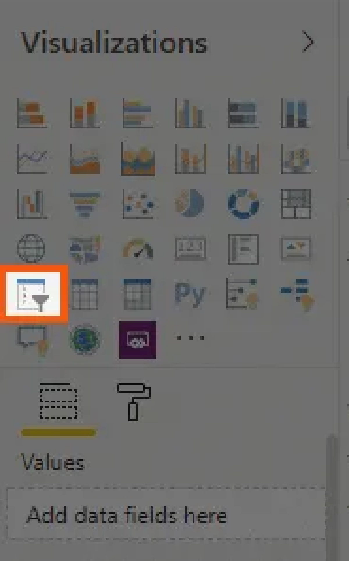
Fig. Slicer icon
You will notice an empty slicer visual on your canvas.
To populate it with content, direct your focus to the fields pane.
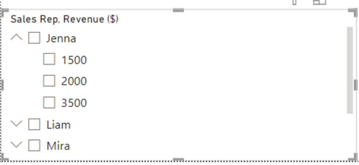
We have added another field of Sales rep to our sample data. We have dragged the sales rep and the total revenue categories to add a slicer.
Step 7: Save and Publish (Optional)
- Save your Power BI report, and if necessary, publish it to the Power BI service to share it with others.
Step 8: Repeat for Other Visualizations (Optional)
- You can repeat the above steps to create additional visualizations based on your aggregated data. For instance, you can create a different visualization to show “Sales Quantity” by “Product Category” or explore other dimensions.
To summarize, data visualization is significant in making sense of complex data. It is a powerful medium to transform your data into actionable insights, enabling informed decision-making capabilities for you and your teammates. So, are you ready to unlock the potential of data visualization for your business?